// Wendy M. Morgan — Portfolio (single direction)
// White paper, italic serif display, color accents on photo frame + tiles.
// Detail page follows the sketch: Selected product → Key Findings → Design
// methodology → Relevant skills → Relevant publications.
// Copy is verbatim from the user's outline.

const T = {
  paper: '#ffffff',
  card: '#fafaf8',
  ink: '#1c1a17',
  inkSoft: '#5a544c',
  inkMute: '#80796f',
  rule: '#e6e4df',
  // Accent palette — muted, AA on white (≥4.5:1 for text-size body)
  c1: '#1f3a5f', // deep blue
  c2: '#5a4a8a', // plum
  c3: '#7a3b2e', // terracotta
  c4: '#3d6b4a', // forest
  // Soft surfaces (large-area tints, not used for body text)
  s1: '#e6ecf4',
  s2: '#ece6f2',
  s3: '#f4e7e2',
  s4: '#e3ecdf',
  sans: '"Inter", "Helvetica Neue", system-ui, sans-serif',
  display: '"Instrument Serif", "GT Sectra", "Tiempos Headline", Georgia, serif',
};

// ─── Hash routing helpers (URL sync only; no layout impact) ───
function buildHash(s) {
  switch (s.page) {
    case 'skills': return '#/skills';
    case 'skill-detail': return '#/skills/' + s.skillKey;
    case 'products': return (s.productView && s.productView !== 'index') ? '#/projects/' + s.productView : '#/projects';
    case 'detail': return '#/project/' + s.productKey;
    case 'pubs': return '#/publications';
    case 'cv': return '#/experience';
    case 'home':
    default: return '#/';
  }
}

function parseHash(hash) {
  const raw = (hash || '').replace(/^#\/?/, '').replace(/\/+$/, '');
  const parts = raw.split('/').filter(Boolean);
  if (parts.length === 0) return { page: 'home' };
  const seg = parts[0], sub = parts[1];
  if (seg === 'skills') {
    if (sub && SKILLS.some((k) => k.key === sub)) return { page: 'skill-detail', skillKey: sub };
    return { page: 'skills' };
  }
  if (seg === 'projects') {
    if (sub && PRODUCT_GROUPS.some((g) => g.id === sub)) return { page: 'products', productView: sub };
    return { page: 'products', productView: 'index' };
  }
  if (seg === 'project') {
    if (sub && PRODUCTS.some((p) => p.key === sub)) return { page: 'detail', productKey: sub };
    return { page: 'products', productView: 'index' };
  }
  if (seg === 'publications') return { page: 'pubs' };
  if (seg === 'experience') return { page: 'cv' };
  return { page: 'home' };
}

function Frame({ width, height }) {
  const initial = parseHash(typeof window !== 'undefined' ? window.location.hash : '');
  const [page, setPage] = React.useState(initial.page || 'home');
  const [productKey, setProductKey] = React.useState(initial.productKey || 'bridging');
  const [productView, setProductView] = React.useState(initial.productView || 'index');
  const [skillKey, setSkillKey] = React.useState(initial.skillKey || 'kt');
  const isMobile = width < 760;

  const go = (p, key) => {
    if (p === 'skill-detail' && key) setSkillKey(key);
    else if (p === 'detail' && key) setProductKey(key);
    else if (p === 'products') setProductView(key || 'index');
    setPage(p);
    requestAnimationFrame(() => {
      const el = document.getElementById('p-scroll');
      if (el) el.scrollTop = 0;
    });
  };

  // Restore view on browser back/forward (and manual hash edits).
  React.useEffect(() => {
    const onPop = () => {
      const st = parseHash(window.location.hash);
      setPage(st.page || 'home');
      if (st.skillKey) setSkillKey(st.skillKey);
      if (st.productKey) setProductKey(st.productKey);
      setProductView(st.productView || 'index');
    };
    window.addEventListener('popstate', onPop);
    window.addEventListener('hashchange', onPop);
    return () => {
      window.removeEventListener('popstate', onPop);
      window.removeEventListener('hashchange', onPop);
    };
  }, []);

  // Keep the URL hash in sync with the current view.
  const didMount = React.useRef(false);
  React.useEffect(() => {
    const h = buildHash({ page, skillKey, productKey, productView });
    if (window.location.hash !== h) {
      if (!didMount.current) window.history.replaceState(null, '', h);
      else window.history.pushState(null, '', h);
    }
    didMount.current = true;
  }, [page, skillKey, productKey, productView]);

  const ctx = { isMobile, pad: isMobile ? 20 : 64 };

  return (
    <div style={{
      width, height, background: T.paper, color: T.ink,
      fontFamily: T.sans, position: 'relative', overflow: 'hidden',
      display: 'flex', flexDirection: 'column',
    }}>
      <Header page={page} go={go} ctx={ctx} />
      <div id="p-scroll" style={{ flex: 1, overflowY: 'auto', overflowX: 'hidden' }}>
        {page === 'home' && <Home go={go} ctx={ctx} />}
        {page === 'skills' && <SkillsIndex go={go} ctx={ctx} />}
        {page === 'skill-detail' && <SkillDetail go={go} ctx={ctx} skillKey={skillKey} />}
        {page === 'products' && <Products go={go} ctx={ctx} view={productView} setView={setProductView} />}
        {page === 'detail' && <Detail go={go} ctx={ctx} productKey={productKey} />}
        {page === 'pubs' && <Publications go={go} ctx={ctx} />}
        {page === 'cv' && <Experience go={go} ctx={ctx} />}
        <Footer ctx={ctx} />
      </div>
    </div>
  );
}

// Returns true if header nav item `it` should be highlighted given current page.
function navActive(it, page) {
  if (it.key === 'skills' && (page === 'skills' || page === 'skill-detail')) return true;
  if (it.key === 'products' && (page === 'products' || page === 'detail')) return true;
  return page === it.key;
}

function Header({ page, go, ctx }) {
  const [open, setOpen] = React.useState(false);
  const items = [
    { key: 'skills', label: 'Selected Skills' },
    { key: 'products', label: 'Selected Projects' },
    { key: 'pubs', label: 'Publications' },
    { key: 'cv', label: 'Experience' },
  ];
  return (
    <header style={{
      padding: ctx.isMobile ? '20px 20px' : '32px 64px', display: 'flex', alignItems: 'center',
      justifyContent: 'space-between', background: T.paper, position: 'relative', zIndex: 2,
      borderBottom: `1px solid ${T.rule}`,
    }}>
      <button onClick={() => { setOpen(false); go('home'); }} aria-label="Wendy M. Morgan, PhD, home"
        style={{
          background: 'none', border: 'none', cursor: 'pointer', padding: 0,
          fontFamily: T.display, 
          fontSize: ctx.isMobile ? 20 : 24, color: T.ink,
          letterSpacing: -0.3, fontWeight: 400,
        }}>
        Wendy M. Morgan, PhD
      </button>
      {ctx.isMobile ? (
        <>
          <button onClick={() => setOpen(!open)} aria-expanded={open} aria-controls="mobile-nav" aria-label="Menu"
            style={{
              background: 'none', border: `1px solid ${T.rule}`, borderRadius: 999,
              padding: '8px 14px', fontFamily: T.sans, fontSize: 13, color: T.ink, cursor: 'pointer',
              minHeight: 44, minWidth: 44,
            }}>{open ? 'Close' : 'Menu'}</button>
          {open && (
            <nav id="mobile-nav" aria-label="Primary"
              style={{
                position: 'absolute', top: '100%', left: 0, right: 0,
                background: T.paper, borderBottom: `1px solid ${T.rule}`,
                padding: '8px 20px 16px', display: 'flex', flexDirection: 'column', gap: 4,
                boxShadow: '0 8px 24px -12px rgba(28,26,23,0.12)',
              }}>
              {items.map((it) => (
                <button key={it.key}
                  onClick={() => { if (!it.disabled) { setOpen(false); go(it.key); } }}
                  aria-current={navActive(it, page) ? 'page' : undefined}
                  disabled={it.disabled}
                  style={{
                    background: 'none', border: 'none', textAlign: 'left',
                    padding: '14px 4px', minHeight: 44,
                    cursor: it.disabled ? 'not-allowed' : 'pointer',
                    fontFamily: T.sans, fontSize: 16, fontWeight: 400,
                    color: it.disabled ? T.inkMute : (navActive(it, page) ? T.ink : T.inkSoft),
                    borderBottom: `1px solid ${T.rule}`,
                  }}>{it.label}{it.disabled && <span style={{ marginLeft: 8, fontSize: 11, color: T.inkMute }}>(soon)</span>}</button>
              ))}
            </nav>
          )}
        </>
      ) : (
        <nav aria-label="Primary" style={{ display: 'flex', alignItems: 'center', gap: 36 }}>
          {items.map((it) => (
            <button key={it.key}
              onClick={() => !it.disabled && go(it.key)}
              aria-current={navActive(it, page) ? 'page' : undefined}
              disabled={it.disabled}
              style={{
                background: 'none', border: 'none', padding: 0,
                cursor: it.disabled ? 'not-allowed' : 'pointer',
                fontFamily: T.sans, fontSize: 14, fontWeight: 400,
                color: it.disabled ? T.inkMute : (navActive(it, page) ? T.ink : T.inkSoft),
                borderBottom: navActive(it, page) ? `1px solid ${T.ink}` : '1px solid transparent',
                paddingBottom: 2,
              }}>{it.label}</button>
          ))}
        </nav>
      )}
    </header>
  );
}

function Footer({ ctx }) {
  return (
    <footer style={{
      padding: ctx.isMobile ? '64px 20px 40px' : '80px 64px 56px',
      borderTop: `1px solid ${T.rule}`, marginTop: 64,
    }}>
      <div style={{ display: 'grid', gridTemplateColumns: ctx.isMobile ? '1fr' : '1fr auto', gap: 32, alignItems: 'end' }}>
        <div>
          <div style={{
            fontFamily: T.display, 
            fontSize: ctx.isMobile ? 40 : 56, lineHeight: 1.05,
            letterSpacing: -1, fontWeight: 400, color: T.ink, marginBottom: 20,
          }}>
            Let's connect.
          </div>
          <a href="mailto:wendymmorgan@gmail.com" style={{
            fontFamily: T.sans, fontSize: 16, color: T.ink, textDecoration: 'none',
            borderBottom: `1px solid ${T.ink}`, paddingBottom: 2,
          }}>wendymmorgan@gmail.com</a>
        </div>
        <div style={{ display: 'flex', gap: 24, fontFamily: T.sans, fontSize: 14, color: T.inkSoft, flexWrap: 'wrap' }}>
          <a href="https://www.linkedin.com/in/wendy-m-morgan-phd/" target="_blank" rel="noopener noreferrer" style={{ color: T.inkSoft, textDecoration: 'none' }}>LinkedIn</a>
          <a href="https://orcid.org/0009-0005-8884-5095" target="_blank" rel="noopener noreferrer" style={{ color: T.inkSoft, textDecoration: 'none' }}>ORCID</a>
        </div>
      </div>
      <div style={{ marginTop: 56, fontFamily: T.sans, fontSize: 12, color: T.inkMute }}>
        © 2026 Wendy M. Morgan, PhD
      </div>
    </footer>
  );
}

// ─────────── HOME ───────────
function Home({ go, ctx }) {
  const tiles = [
    { title: 'Selected Skills', target: 'skills', surface: T.s1, edge: T.c1, icon: 'assets/icons/skills-tint.png' },
    { title: 'Selected Projects', target: 'products', surface: T.s4, edge: T.c4, icon: 'assets/icons/projects-tint.png' },
    { title: 'Publications, Presentations, & Products', target: 'pubs', surface: T.s2, edge: T.c2, icon: 'assets/icons/pubsetc-tint.png' },
    { title: 'Awards & Experience', target: 'cv', surface: T.s3, edge: T.c3, icon: 'assets/icons/experience-tint.png' },
  ];
  return (
    <main style={{ padding: ctx.isMobile ? '32px 20px 0' : '40px 64px 0' }}>
      {/* Hero */}
      <section style={{
        display: 'grid',
        gridTemplateColumns: ctx.isMobile ? '1fr' : '1.5fr 1fr',
        gap: ctx.isMobile ? 40 : 80,
        alignItems: 'start',
        paddingTop: ctx.isMobile ? 0 : 16,
        paddingBottom: ctx.isMobile ? 32 : 40,
      }}>
        <div style={{ order: ctx.isMobile ? 2 : 1 }}>
          <h1 style={{
            fontFamily: T.display,
            fontSize: ctx.isMobile ? 40 : 'clamp(48px, 5vw, 68px)',
            lineHeight: 1.08, letterSpacing: -1, fontWeight: 400,
            margin: 0, color: T.ink, textWrap: 'pretty',
          }}>
            Leading learning and behavior-change initiatives that measurably shift practice, strategy through evaluation.
          </h1>
          <div style={{ marginTop: 32, display: 'flex', flexWrap: 'wrap', gap: '10px 14px' }}>
            {SKILLS.map((s) => (
              <button key={s.key} onClick={() => go('skill-detail', s.key)}
                style={{
                  background: 'none', border: 'none', padding: '0 0 2px',
                  fontFamily: T.sans, fontSize: 14, color: T.ink, cursor: 'pointer',
                  borderBottom: `1px solid ${T.rule}`, minHeight: 24, textAlign: 'left',
                }}>{s.label}</button>
            ))}
          </div>
        </div>
        <figure style={{ margin: 0, order: ctx.isMobile ? 1 : 2 }}>
          <div style={{ position: 'relative' }}>
            {/* Color frame: offset block behind the photo */}
            <div aria-hidden="true" style={{
              position: 'absolute', inset: 0, transform: 'translate(14px, 14px)',
              background: T.c1, borderRadius: 4,
            }} />
            <div style={{
              position: 'relative', width: '100%', aspectRatio: '5/4', overflow: 'hidden',
              background: T.s1, borderRadius: 4,
              outline: `1px solid ${T.rule}`,
            }}>
              <img src="assets/wendy.png" alt="Wendy M. Morgan, PhD"
                style={{ width: '100%', height: '100%', objectFit: 'cover', objectPosition: 'center top', display: 'block' }} />
            </div>
          </div>
        </figure>
      </section>

      {/* Tiles */}
      <section style={{
        display: 'grid',
        gridTemplateColumns: ctx.isMobile ? '1fr' : 'repeat(2, 1fr)',
        gap: ctx.isMobile ? 16 : 24,
        paddingBottom: 24,
      }}>
        {tiles.map((t) => <Tile key={t.title} {...t} go={go} ctx={ctx} />)}
      </section>
    </main>
  );
}

function Tile({ title, target, surface, edge, icon, go, ctx }) {
  const [hov, setHov] = React.useState(false);
  return (
    <button
      onClick={() => go(target)}
      onMouseEnter={() => setHov(true)} onMouseLeave={() => setHov(false)}
      style={{
        textAlign: 'left', cursor: 'pointer',
        background: surface, color: T.ink,
        border: 'none', borderRadius: 6,
        padding: ctx.isMobile ? '40px 28px 28px' : '64px 40px 40px',
        minHeight: ctx.isMobile ? 200 : 280,
        display: 'flex', flexDirection: 'column', justifyContent: 'space-between',
        fontFamily: T.sans,
        position: 'relative',
        transform: hov ? 'translateY(-3px)' : 'translateY(0)',
        boxShadow: hov ? '0 18px 40px -20px rgba(28,26,23,0.18)' : '0 1px 2px rgba(28,26,23,0.04)',
        transition: 'transform .25s, box-shadow .25s',
        overflow: 'hidden',
      }}>
      <div aria-hidden="true" style={{
        position: 'absolute', left: 0, top: 0, bottom: 0, width: 4, background: edge,
      }} />
      <div>
        {icon && (
          <img src={icon} alt="" aria-hidden="true" style={{
            height: ctx.isMobile ? 40 : 48, width: 'auto', objectFit: 'contain',
            display: 'block', marginBottom: ctx.isMobile ? 20 : 28,
          }} />
        )}
        <div style={{
          fontFamily: T.display,
          fontSize: ctx.isMobile ? 32 : 44, lineHeight: 1.05,
          letterSpacing: -0.6, fontWeight: 400, color: T.ink, textWrap: 'balance',
        }}>
          {title}
        </div>
      </div>
      <div style={{
        fontFamily: T.sans, fontSize: 13, color: edge, fontWeight: 500,
        display: 'flex', alignItems: 'center', gap: 8,
        transform: hov ? 'translateX(4px)' : 'translateX(0)', transition: 'transform .25s',
      }}>
        View<span aria-hidden="true">→</span>
      </div>
    </button>
  );
}

// ─────────── PRODUCTS ───────────
const PRODUCTS = [
  { key: 'cprt', group: 'impact', title: 'CPRT Implementation Product Suite', surface: T.s1, edge: T.c1, image: 'assets/cprt-screenshot.png', imageFit: 'contain' },
  { key: 'bridging', group: 'impact', title: 'Bridging Neuroscience and Juvenile Justice', surface: T.s4, edge: T.c4, image: 'assets/bridging-workshop.jpg' },
  { key: 'afirm', group: 'impact', title: 'AFIRM for Paras', surface: T.s2, edge: T.c2, image: 'assets/afirm-screenshot.png', imageFit: 'contain' },
  { key: 'pbis', group: 'impact', title: 'Michigan PBIS Implementation', surface: T.s3, edge: T.c3, image: 'assets/pbis-tile.png', imageFit: 'contain' },
  { key: 'dashboards', group: 'innovation', title: 'Data Dashboards for Targeted Action', surface: T.s2, edge: T.c2, image: 'assets/dashboards-tile.png', imageFit: 'contain' },
  { key: 'aitools', group: 'innovation', title: 'AI Tools & Enablement', surface: T.s4, edge: T.c4, image: 'assets/aitools-tile.png', imageFit: 'contain' },
];

const PRODUCT_GROUPS = [
  { id: 'impact', label: 'Impact', edge: T.c1, surface: T.s1, icon: 'assets/icons/impact-tint.png' },
  { id: 'innovation', label: 'Innovation', edge: T.c2, surface: T.s2, icon: 'assets/icons/innovation-tint.png' },
];

function Products({ go, ctx, view, setView }) {
  const group = PRODUCT_GROUPS.find((g) => g.id === view);
  const resetScroll = () => { const el = document.getElementById('p-scroll'); if (el) el.scrollTop = 0; };

  // ── Group view: the project cards, exactly as before ──
  if (group) {
    return (
      <main style={{ padding: ctx.isMobile ? '24px 20px 0' : '32px 64px 0' }}>
        <div style={{ marginBottom: ctx.isMobile ? 20 : 28, fontFamily: T.sans, fontSize: 13 }}>
          <button onClick={() => { setView('index'); resetScroll(); }} style={{
            background: 'none', border: 'none', cursor: 'pointer', padding: '8px 0',
            color: T.inkSoft, fontFamily: 'inherit', fontSize: 'inherit', minHeight: 36,
          }}>← Selected Projects</button>
        </div>
        <section style={{ paddingBottom: ctx.isMobile ? 28 : 40 }}>
          <div style={{ display: 'flex', alignItems: 'baseline', gap: 12, marginBottom: 4 }}>
            <span style={{ fontFamily: T.sans, fontSize: 13, color: T.inkMute, letterSpacing: 0.4, textTransform: 'uppercase', fontWeight: 500 }}>Focus on</span>
          </div>
          <h1 style={{
            fontFamily: T.display,
            fontSize: ctx.isMobile ? 44 : 'clamp(52px, 6vw, 88px)',
            lineHeight: 1, letterSpacing: -1.4, fontWeight: 400,
            margin: 0, color: group.edge, textWrap: 'balance',
          }}>{group.label}</h1>
        </section>
        <div style={{
          display: 'grid',
          gridTemplateColumns: ctx.isMobile ? '1fr' : 'repeat(2, 1fr)',
          gap: ctx.isMobile ? 16 : 24, paddingBottom: 24,
        }}>
          {PRODUCTS.filter((p) => p.group === group.id).map((p) => <ProductCard key={p.key} p={p} go={go} ctx={ctx} />)}
        </div>
      </main>
    );
  }

  // ── Index view: branching choice ──
  return (
    <main style={{ padding: ctx.isMobile ? '32px 20px 0' : '40px 64px 0' }}>
      <section style={{ paddingBottom: ctx.isMobile ? 28 : 40, maxWidth: 880 }}>
        <h1 style={{
          fontFamily: T.display,
          fontSize: ctx.isMobile ? 40 : 'clamp(48px, 5.6vw, 76px)',
          lineHeight: 1.05, letterSpacing: -1.2, fontWeight: 400,
          margin: 0, color: T.ink, textWrap: 'balance',
        }}>
          Selected Projects
        </h1>
      </section>
      <section style={{
        display: 'grid',
        gridTemplateColumns: ctx.isMobile ? '1fr' : 'repeat(2, 1fr)',
        gap: ctx.isMobile ? 16 : 24, paddingBottom: 24,
      }}>
        {PRODUCT_GROUPS.map((g) => (
          <ProjectGroupCard key={g.id} g={g} ctx={ctx}
            onOpen={() => { setView(g.id); resetScroll(); }} />
        ))}
      </section>
    </main>
  );
}

function ProjectGroupCard({ g, ctx, onOpen }) {
  const [hov, setHov] = React.useState(false);
  return (
    <button
      onClick={onOpen}
      onMouseEnter={() => setHov(true)} onMouseLeave={() => setHov(false)}
      style={{
        textAlign: 'left', cursor: 'pointer',
        background: g.surface, color: T.ink, border: 'none', borderRadius: 6,
        padding: ctx.isMobile ? '32px 28px 28px 32px' : '40px 32px 32px 40px',
        minHeight: ctx.isMobile ? 200 : 280, position: 'relative', overflow: 'hidden',
        display: 'flex', flexDirection: 'column', justifyContent: 'space-between',
        fontFamily: T.sans,
        transform: hov ? 'translateY(-3px)' : 'translateY(0)',
        boxShadow: hov ? '0 18px 40px -20px rgba(28,26,23,0.18)' : '0 1px 2px rgba(28,26,23,0.04)',
        transition: 'transform .25s, box-shadow .25s',
      }}>
      <div aria-hidden="true" style={{ position: 'absolute', left: 0, top: 0, bottom: 0, width: 4, background: g.edge }} />
      <div>
        {g.icon && (
          <img src={g.icon} alt="" aria-hidden="true" style={{
            height: ctx.isMobile ? 38 : 44, width: 'auto', objectFit: 'contain',
            display: 'block', marginBottom: ctx.isMobile ? 16 : 22,
          }} />
        )}
        <div style={{ fontFamily: T.sans, fontSize: 13, color: g.edge, letterSpacing: 0.4, textTransform: 'uppercase', fontWeight: 600, marginBottom: 8 }}>Focus on</div>
        <div style={{
          fontFamily: T.display, fontSize: ctx.isMobile ? 40 : 52, lineHeight: 1,
          letterSpacing: -1, fontWeight: 400, color: T.ink, textWrap: 'balance',
        }}>{g.label}</div>
      </div>
      <div style={{ display: 'flex', alignItems: 'baseline', justifyContent: 'flex-end', marginTop: 28 }}>
        <span style={{
          fontFamily: T.sans, fontSize: 13, color: g.edge, fontWeight: 500,
          display: 'flex', alignItems: 'center', gap: 8,
          transform: hov ? 'translateX(4px)' : 'translateX(0)', transition: 'transform .25s',
        }}>
          View all<span aria-hidden="true">→</span>
        </span>
      </div>
    </button>
  );
}

function ProductCard({ p, go, ctx }) {
  const [hov, setHov] = React.useState(false);
  return (
    <button
      onClick={() => go('detail', p.key)}
      onMouseEnter={() => setHov(true)} onMouseLeave={() => setHov(false)}
      style={{
        textAlign: 'left', cursor: 'pointer',
        background: p.surface, color: T.ink,
        border: 'none', borderRadius: 6, padding: 0, overflow: 'hidden',
        display: 'flex', flexDirection: 'column',
        fontFamily: T.sans, minHeight: ctx.isMobile ? 280 : 360,
        position: 'relative',
        transform: hov ? 'translateY(-3px)' : 'translateY(0)',
        boxShadow: hov ? '0 18px 40px -20px rgba(28,26,23,0.18)' : '0 1px 2px rgba(28,26,23,0.04)',
        transition: 'transform .25s, box-shadow .25s',
      }}>
      <div aria-hidden="true" style={{
        position: 'absolute', left: 0, top: 0, bottom: 0, width: 4, background: p.edge, zIndex: 1,
      }} />
      {/* Image area */}
      <div style={{
        ...(p.imageAspect ? { aspectRatio: p.imageAspect } : { height: ctx.isMobile ? 200 : 260 }),
        background: '#fff',
        position: 'relative', overflow: 'hidden',
        display: 'flex', alignItems: 'center', justifyContent: 'center',
        borderBottom: `1px solid ${T.rule}`,
      }}>
        {p.image ? (
          <img src={p.image} alt=""
            style={{
              width: '100%', height: '100%',
              objectFit: p.imageFit || 'cover', objectPosition: 'center',
            }} />
        ) : (
          <span style={{
            fontFamily: T.sans, fontSize: 12, color: p.edge,
            letterSpacing: 0.4, textTransform: 'uppercase', fontWeight: 500,
            background: '#fff', padding: '8px 14px', borderRadius: 999,
            border: `1px solid ${T.rule}`,
          }}>Cover image</span>
        )}
      </div>
      <div style={{
        padding: ctx.isMobile ? '24px 24px 24px' : '32px 36px 32px',
        flex: 1, display: 'flex', flexDirection: 'column', justifyContent: 'space-between',
      }}>
        <div style={{
          fontFamily: T.display, 
          fontSize: ctx.isMobile ? 26 : 32, lineHeight: 1.1,
          letterSpacing: -0.6, fontWeight: 400, color: T.ink, textWrap: 'balance',
        }}>{p.title}</div>
        <div style={{
          marginTop: 24, fontFamily: T.sans, fontSize: 13, color: p.edge, fontWeight: 500,
          display: 'flex', alignItems: 'center', gap: 8,
          transform: hov ? 'translateX(4px)' : 'translateX(0)', transition: 'transform .25s',
        }}>
          Read<span aria-hidden="true">→</span>
        </div>
      </div>
    </button>
  );
}

// ─────────── DETAIL ───────────
// Layout follows the sketch:
//  i.  Selected product: screenshot + link
//  iii. Key Findings (two columns: Problem / Solution + Result)
//  iv.  Design methodology (3 phases)
//       Relevant skills (tiles)
//       Relevant publications
function Detail({ go, ctx, productKey }) {
  if (productKey === 'cprt') return <CprtDetail go={go} ctx={ctx} />;
  if (productKey === 'afirm') return <AfirmDetail go={go} ctx={ctx} />;
  if (productKey === 'pbis') return <MichiganPbisDetail go={go} ctx={ctx} />;
  if (productKey === 'dashboards') return <DataDashboardsDetail go={go} ctx={ctx} />;
  if (productKey === 'aitools') return <AiToolsDetail go={go} ctx={ctx} />;
  return <BridgingDetail go={go} ctx={ctx} />;
}

// ─── Shared bits ──────────────────────────────────────────────
function DetailBreadcrumb({ go, ctx, target = 'products', label = 'Selected Projects', group }) {
  let onClick = () => go(target);
  let lbl = label;
  if (group === 'impact') { lbl = 'Focus on: Impact'; onClick = () => go('products', 'impact'); }
  else if (group === 'innovation') { lbl = 'Focus on: Innovation'; onClick = () => go('products', 'innovation'); }
  return (
    <div style={{ marginBottom: ctx.isMobile ? 24 : 32, display: 'flex', alignItems: 'center', gap: 10, fontFamily: T.sans, fontSize: 13 }}>
      <button onClick={onClick} style={{
        background: 'none', border: 'none', cursor: 'pointer', padding: '8px 0',
        color: T.inkSoft, fontFamily: 'inherit', fontSize: 'inherit', minHeight: 36,
      }}>← {lbl}</button>
    </div>
  );
}

// ─── CPRT Implementation Product Suite ────────────────────────
function CprtDetail({ go, ctx }) {
  return (
    <main style={{ padding: ctx.isMobile ? '24px 20px 0' : '32px 64px 0' }}>
      <DetailBreadcrumb go={go} ctx={ctx} group="impact" />

      {/* Title — plain (suite contains 2 products, linked below) */}
      <section style={{ paddingBottom: ctx.isMobile ? 32 : 48, maxWidth: 1100 }}>
        <h1 style={{
          fontFamily: T.display,
          fontSize: ctx.isMobile ? 40 : 'clamp(48px, 5.8vw, 84px)',
          lineHeight: 1.05, letterSpacing: -1.4, fontWeight: 400,
          margin: 0, color: T.ink, textWrap: 'balance',
        }}>
          CPRT Implementation Product Suite
        </h1>
      </section>

      {/* SELECTED PRODUCT — screenshot + two live product links */}
      <section style={{
        paddingBottom: ctx.isMobile ? 40 : 56,
        display: 'grid',
        gridTemplateColumns: ctx.isMobile ? '1fr' : '1.4fr 1fr',
        gap: ctx.isMobile ? 24 : 48,
        alignItems: 'start',
      }}>
        <figure style={{ margin: 0 }}>
          <div style={{ position: 'relative' }}>
            <div aria-hidden="true" style={{
              position: 'absolute', inset: 0, transform: 'translate(10px, 10px)',
              background: T.c1, borderRadius: 4,
            }} />
            <div style={{
              position: 'relative', background: T.s1, borderRadius: 4, overflow: 'hidden',
              outline: `1px solid ${T.rule}`,
            }}>
              <img src="assets/cprt-case-study.png" alt="Lesson selection menu from the CPRT Interactive Case Study"
                style={{ width: '100%', display: 'block' }} />
            </div>
          </div>
          <figcaption style={{
            marginTop: 22, fontFamily: T.sans, fontSize: 12, color: T.inkMute,
            letterSpacing: 0.3, textTransform: 'uppercase', fontWeight: 500,
          }}>
            Interactive Case Study: lesson menu
          </figcaption>
        </figure>
        <div>
          <div style={{ fontFamily: T.sans, fontSize: 12, color: T.inkMute, marginBottom: 12, letterSpacing: 0.3, textTransform: 'uppercase', fontWeight: 500 }}>
            Projects
          </div>
          <p style={{ fontFamily: T.sans, fontSize: 16, lineHeight: 1.6, color: T.ink, margin: '0 0 20px', textWrap: 'pretty' }}>
            Blended learning product suite to support teachers to use and appropriately adapt the Classroom Pivotal Response Teaching (CPRT) autism intervention.
          </p>
          <div style={{ display: 'grid', gap: 12 }}>
            {[
              { label: 'Interactive Case Study', url: 'https://classroomcprt.sdsu.edu/interactive.html' },
              { label: 'Individualization Tool', url: 'https://classroomcprt.sdsu.edu/decision/story.html' },
              { label: 'Comprehensive Reference Guide', url: 'https://classroomcprt.sdsu.edu/rise/' },
            ].map((it) => (
              <a key={it.label} href={it.url} target="_blank" rel="noopener noreferrer"
                style={{
                  fontFamily: T.sans, fontSize: 15, fontWeight: 500, color: T.ink,
                  textDecoration: 'none', background: T.s1, borderRadius: 4,
                  padding: '16px 20px', display: 'flex', alignItems: 'center',
                  justifyContent: 'space-between', gap: 12,
                  borderLeft: `3px solid ${T.c1}`, minHeight: 44,
                }}>
                <span>{it.label}</span>
                <span aria-hidden="true" style={{ color: T.c1, fontSize: 14, fontWeight: 500 }}>Open ↗</span>
              </a>
            ))}
          </div>
        </div>
      </section>

      {/* KEY FINDINGS */}
      <section style={{
        paddingTop: ctx.isMobile ? 32 : 48, paddingBottom: ctx.isMobile ? 40 : 56,
        borderTop: `1px solid ${T.rule}`,
      }}>
        <div style={{ fontFamily: T.sans, fontSize: 12, color: T.inkMute, marginBottom: 24, letterSpacing: 0.3, textTransform: 'uppercase', fontWeight: 500 }}>
          Key Findings
        </div>
        <div style={{
          display: 'grid', gridTemplateColumns: ctx.isMobile ? '1fr' : '1fr 1fr',
          gap: ctx.isMobile ? 32 : 48,
        }}>
          {/* Problem */}
          <div style={{ borderLeft: `3px solid ${T.c3}`, paddingLeft: 20 }}>
            <div style={{ fontFamily: T.display, fontSize: 28, lineHeight: 1.1, letterSpacing: -0.4, fontWeight: 400, color: T.ink, marginBottom: 14 }}>
              Problem
            </div>
            <p style={{ fontFamily: T.sans, fontSize: 16, lineHeight: 1.6, color: T.ink, margin: '0 0 12px', textWrap: 'pretty' }}>
              Two main issues:
            </p>
            <ol style={{ margin: 0, paddingLeft: 20 }}>
              <li style={{ fontFamily: T.sans, fontSize: 16, lineHeight: 1.6, color: T.ink, marginBottom: 8, textWrap: 'pretty' }}>
                Teachers regularly adapt CPRT but receive no training related to adaptation.
              </li>
              <li style={{ fontFamily: T.sans, fontSize: 16, lineHeight: 1.6, color: T.ink, textWrap: 'pretty' }}>
                Teachers require training but cannot always access typical in-person, multi-day training sessions.
              </li>
            </ol>
          </div>

          {/* Solution */}
          <div style={{ borderLeft: `3px solid ${T.c1}`, paddingLeft: 20 }}>
            <div style={{ fontFamily: T.display, fontSize: 28, lineHeight: 1.1, letterSpacing: -0.4, fontWeight: 400, color: T.ink, marginBottom: 14 }}>
              Solution
            </div>
            <p style={{ fontFamily: T.sans, fontSize: 16, lineHeight: 1.6, color: T.ink, margin: '0 0 14px', textWrap: 'pretty' }}>
              <strong style={{ fontWeight: 600 }}>Cross-functional team of four:</strong> a designer, two autism experts, and a teacher coach.
            </p>
            <p style={{ fontFamily: T.sans, fontSize: 16, lineHeight: 1.6, color: T.ink, margin: '0 0 8px', textWrap: 'pretty' }}>
              <strong style={{ fontWeight: 600 }}>Overall (initial) design:</strong>
            </p>
            <ol style={{ margin: '0 0 14px', paddingLeft: 20 }}>
              <li style={{ fontFamily: T.sans, fontSize: 16, lineHeight: 1.6, color: T.ink, marginBottom: 10, textWrap: 'pretty' }}>
                A performance support "calculator" tool to help teachers determine which CPRT components should be prioritized for individual students and instructional settings.
              </li>
              <li style={{ fontFamily: T.sans, fontSize: 16, lineHeight: 1.6, color: T.ink, textWrap: 'pretty' }}>
                A virtual training module to allow hands-on application of CPRT concepts while supporting large-scale training tailored to teachers and paraprofessionals.
                <ul style={{ margin: '8px 0 0', paddingLeft: 20 }}>
                  <li style={{ fontFamily: T.sans, fontSize: 15, lineHeight: 1.55, color: T.inkSoft, textWrap: 'pretty' }}>
                    This virtual training module was designed to passively collect user data for coach reports allowing individualized follow-up support.
                  </li>
                </ul>
              </li>
            </ol>
            <p style={{ fontFamily: T.sans, fontSize: 16, lineHeight: 1.6, color: T.ink, margin: 0, textWrap: 'pretty' }}>
              <strong style={{ fontWeight: 600 }}>Knowledge translation:</strong> The results of a meta-analysis of several studies exploring which adaptations work and which do across a variety of contexts was translated to a calculator performance support for teachers to utilize.
            </p>
          </div>
        </div>

        {/* Result */}
        <div style={{
          marginTop: ctx.isMobile ? 32 : 40,
          background: T.s4, borderRadius: 4, padding: ctx.isMobile ? '24px 24px' : '32px 40px',
          borderLeft: `3px solid ${T.c4}`,
        }}>
          <div style={{ fontFamily: T.display, fontSize: 28, lineHeight: 1.1, letterSpacing: -0.4, fontWeight: 400, color: T.ink, marginBottom: 14 }}>
            Result
          </div>
          <p style={{ fontFamily: T.sans, fontSize: 16, lineHeight: 1.6, color: T.ink, margin: 0, textWrap: 'pretty' }}>
            This approach resulted in clear skill gains: In a randomized control trial, 81% of participants with no prior knowledge of CPRT were able to implement it with fidelity. User experience research indicated that the materials were clear, engaging, usable, and useful.
          </p>
        </div>
      </section>

      {/* DESIGN METHODOLOGY */}
      <section style={{
        paddingTop: ctx.isMobile ? 32 : 48, paddingBottom: ctx.isMobile ? 40 : 56,
        borderTop: `1px solid ${T.rule}`,
      }}>
        <div style={{ fontFamily: T.sans, fontSize: 12, color: T.inkMute, marginBottom: 24, letterSpacing: 0.3, textTransform: 'uppercase', fontWeight: 500 }}>
          Design methodology
        </div>
        <ol style={{ listStyle: 'none', margin: 0, padding: 0, display: 'grid', gap: 0 }}>
          <Phase num={1} color={T.c1} title="Proof of concept"
            groups={[
              { label: 'Began with', items: ['Deep literature search', 'Analysis of data from previous studies'] },
              { label: 'Concluded with', items: ['Clear learning objectives', 'Initial blended design concept with two digital products and coach reports'] },
            ]} />
          <Phase num={2} color={T.c2} title="Proof of product"
            groups={[
              { label: 'Iterative design and development of', items: [
                { text: 'Digital products', items: ['Individualization tool (calculator-style)', 'Interactive case study (with coach reports)'] },
                'Support materials provided alongside & within digital products',
                'Coach reports and job aides explaining how to use them',
              ] },
              { label: 'Key pivot points from user testing cycles', items: [
                { text: 'Provide more support materials for teachers and coaches', items: [
                  'Develop comprehensive reference guide to allow deeper understanding of CPRT',
                  'Provide in-depth example lesson plans and templates within individualization tool',
                  'Develop guide for coaches explaining how to use coach reports to tailor their follow-up support',
                ] },
                'Avoid repetitive choices within scenario-based interactions',
              ] },
            ]} />
          <Phase num={3} color={T.c4} title="Proof of application"
            groups={[
              { label: 'Evaluation', items: ['Collection and analysis of quantitative and qualitative data reflecting knowledge gained, user experience, and alignment with workflow.'] },
            ]} last />
        </ol>
      </section>

      {/* RELEVANT SKILLS */}
      <section style={{
        paddingTop: ctx.isMobile ? 32 : 48, paddingBottom: ctx.isMobile ? 32 : 48,
        borderTop: `1px solid ${T.rule}`,
      }}>
        <div style={{ fontFamily: T.sans, fontSize: 12, color: T.inkMute, marginBottom: 20, letterSpacing: 0.3, textTransform: 'uppercase', fontWeight: 500 }}>
          Relevant skills
        </div>
        <div style={{
          display: 'grid',
          gridTemplateColumns: ctx.isMobile ? '1fr' : 'repeat(3, 1fr)',
          gap: 12,
        }}>
          {[
            { label: 'Leadership, Systems, & Strategy', key: 'kt', surface: T.s1, edge: T.c1 },
            { label: 'Design & Development', key: 'product', surface: T.s2, edge: T.c2 },
            { label: 'Behavioral Science', key: 'research', surface: T.s3, edge: T.c3 },
          ].map((s) => (
            <button key={s.label} onClick={() => go('skill-detail', s.key)} style={{
              fontFamily: T.sans, fontSize: 15, fontWeight: 500, color: T.ink, textAlign: 'left',
              background: s.surface, borderRadius: 4, border: 'none', cursor: 'pointer',
              padding: ctx.isMobile ? '20px 20px' : '24px 24px',
              minHeight: 44, display: 'flex', alignItems: 'center', justifyContent: 'space-between',
              borderLeft: `3px solid ${s.edge}`,
            }}>
              <span>{s.label}</span>
              <span aria-hidden="true" style={{ color: s.edge, fontSize: 14 }}>→</span>
            </button>
          ))}
        </div>
      </section>

      {/* RELEVANT PUBLICATIONS AND PRESENTATIONS */}
      <section style={{
        paddingTop: ctx.isMobile ? 24 : 32, paddingBottom: ctx.isMobile ? 24 : 32,
        borderTop: `1px solid ${T.rule}`,
      }}>
        <div style={{ fontFamily: T.sans, fontSize: 12, color: T.inkMute, marginBottom: 12, letterSpacing: 0.3, textTransform: 'uppercase', fontWeight: 500 }}>
          Relevant publications and presentations
        </div>
        <ul style={{ listStyle: 'none', margin: 0, padding: 0 }}>
          <li style={{
            padding: '12px 0', borderBottom: `1px solid ${T.rule}`,
            fontFamily: T.sans, fontSize: 14, lineHeight: 1.55, color: T.ink, textWrap: 'pretty',
          }}>
            <strong style={{ fontWeight: 600 }}>Morgan, W.M.</strong>, Sam, A., Suhrheinrich, J., &amp; Chan, J. (2026). An initial application of SCILDD: A Strategic, Co-created, and Iterative Learning Design and Development process. <em>Educational Technology Research and Development.</em>{' '}
            <a href="https://doi.org/10.1007/s11423-026-10590-6"
              style={{ color: T.c1, textDecoration: 'none', borderBottom: `1px solid ${T.c1}`, paddingBottom: 1, wordBreak: 'break-word' }}>
              https://doi.org/10.1007/s11423-026-10590-6
            </a>
            {' '}[For complimentary, full access:{' '}
            <a href="https://rdcu.be/e0Oui"
              style={{ color: T.c1, fontWeight: 500, textDecoration: 'none', borderBottom: `1px solid ${T.c1}`, paddingBottom: 1 }}>
              https://rdcu.be/e0Oui
            </a>]
          </li>
          <li style={{
            padding: '12px 0',
            fontFamily: T.sans, fontSize: 14, lineHeight: 1.55, color: T.ink, textWrap: 'pretty',
          }}>
            <strong style={{ fontWeight: 600 }}>Morgan, W.</strong> (2023, September 21). <em>Classroom Pivotal Response Teaching (CPRT) Learning Module and Individualization Tool.</em> Technology demonstration at the 2023 ED Games Expo, Institute of Education Sciences (IES), Washington, DC.
          </li>
        </ul>
      </section>
    </main>
  );
}

// ─── AFIRM for Paras ──────────────────────────────────────────
function AfirmDetail({ go, ctx }) {
  const links = [
    { label: 'AFIRM website', url: 'https://afirm.fpg.unc.edu/afirm-modules/afirm-for-paraprofessionals/' },
    { label: 'Prompting Module', url: 'https://afirm-modules.fpg.unc.edu/Prompting-Introduction-Practice/content/' },
    { label: 'Reinforcement Module', url: 'https://afirm-modules.fpg.unc.edu/Reinforcement-Introduction-Practice/content/' },
    { label: 'Supporting Peer Interactions', url: 'https://afirm-modules.fpg.unc.edu/Supporting-Peer-Interactions-Introduction-Practice/content/' },
    { label: 'Time Delay Module', url: 'https://afirm-modules.fpg.unc.edu/Time-Delay-Introduction-Practice/content/' },
    { label: 'Visual Cues Module', url: 'https://afirm-modules.fpg.unc.edu/Visual-Cues-Introduction-Practice/content/' },
  ];
  return (
    <main style={{ padding: ctx.isMobile ? '24px 20px 0' : '32px 64px 0' }}>
      <DetailBreadcrumb go={go} ctx={ctx} group="impact" />

      {/* Title */}
      <section style={{ paddingBottom: ctx.isMobile ? 32 : 48, maxWidth: 1100 }}>
        <h1 style={{
          fontFamily: T.display,
          fontSize: ctx.isMobile ? 40 : 'clamp(48px, 5.8vw, 84px)',
          lineHeight: 1.05, letterSpacing: -1.4, fontWeight: 400,
          margin: 0, color: T.ink, textWrap: 'balance',
        }}>
          AFIRM for Paras
        </h1>
      </section>

      {/* SELECTED PRODUCT — screenshot + module links + blurb */}
      <section style={{
        paddingBottom: ctx.isMobile ? 40 : 56,
        display: 'grid',
        gridTemplateColumns: ctx.isMobile ? '1fr' : '1.4fr 1fr',
        gap: ctx.isMobile ? 24 : 48,
        alignItems: 'start',
      }}>
        <figure style={{ margin: 0 }}>
          <div style={{ position: 'relative' }}>
            <div aria-hidden="true" style={{
              position: 'absolute', inset: 0, transform: 'translate(10px, 10px)',
              background: T.c2, borderRadius: 4,
            }} />
            <div style={{
              position: 'relative', background: T.s2, borderRadius: 4, overflow: 'hidden',
              outline: `1px solid ${T.rule}`,
            }}>
              <img src="assets/afirm-detail.png" alt="AFIRM for Paras planning workflow: the three EBP steps (Plan, Use, Monitor) above a photo of a paraprofessional supporting a child, beside a completed Reinforcement Planning Guide for a student named Lucy"
                style={{ width: '100%', display: 'block' }} />
            </div>
          </div>
          <figcaption style={{
            marginTop: 22, fontFamily: T.sans, fontSize: 12, color: T.inkMute,
            letterSpacing: 0.3, textTransform: 'uppercase', fontWeight: 500,
          }}>
            Reinforcement Planning Guide, completed during virtual practice
          </figcaption>
        </figure>
        <div>
          <div style={{ fontFamily: T.sans, fontSize: 12, color: T.inkMute, marginBottom: 12, letterSpacing: 0.3, textTransform: 'uppercase', fontWeight: 500 }}>
            Project
          </div>
          <p style={{ fontFamily: T.sans, fontSize: 16, lineHeight: 1.6, color: T.ink, margin: '0 0 20px', textWrap: 'pretty' }}>
            Autism Focused Intervention Resources and Modules (AFIRM) provide universally available, hands-on online professional development that trains paraprofessionals to implement evidence-based practices (EBPs) with children with autism spectrum disorder (ASD) by using real classroom video, on-the-job materials, and automatically generated personalized feedback.
          </p>
          <div style={{ display: 'grid', gap: 12 }}>
            {links.map((it) => (
              <a key={it.label} href={it.url} target="_blank" rel="noopener noreferrer"
                style={{
                  fontFamily: T.sans, fontSize: 15, fontWeight: 500, color: T.ink,
                  textDecoration: 'none', background: T.s2, borderRadius: 4,
                  padding: '16px 20px', display: 'flex', alignItems: 'center',
                  justifyContent: 'space-between', gap: 12,
                  borderLeft: `3px solid ${T.c2}`, minHeight: 44,
                }}>
                <span>{it.label}</span>
                <span aria-hidden="true" style={{ color: T.c2, fontSize: 14, fontWeight: 500 }}>Open ↗</span>
              </a>
            ))}
          </div>
        </div>
      </section>

      {/* KEY FINDINGS */}
      <section style={{
        paddingTop: ctx.isMobile ? 32 : 48, paddingBottom: ctx.isMobile ? 40 : 56,
        borderTop: `1px solid ${T.rule}`,
      }}>
        <div style={{ fontFamily: T.sans, fontSize: 12, color: T.inkMute, marginBottom: 24, letterSpacing: 0.3, textTransform: 'uppercase', fontWeight: 500 }}>
          Key findings
        </div>
        <div style={{
          display: 'grid', gridTemplateColumns: ctx.isMobile ? '1fr' : '1fr 1fr',
          gap: ctx.isMobile ? 32 : 48,
        }}>
          {/* Problem */}
          <div style={{ borderLeft: `3px solid ${T.c3}`, paddingLeft: 20 }}>
            <div style={{ fontFamily: T.display, fontSize: 28, lineHeight: 1.1, letterSpacing: -0.4, fontWeight: 400, color: T.ink, marginBottom: 14 }}>
              Problem
            </div>
            <ul style={{ listStyle: 'none', margin: 0, padding: 0, display: 'grid', gap: 10 }}>
              {[
                'Individuals with little or no special education training often take positions as paraprofessionals (paras) supporting children with ASD.',
                'Federal law requires training and PD, but most states neither require initial training nor provide ongoing PD.',
                'Where training exists, it rarely translates into use of strategies in practice.',
                <span>Effective PD must be (a) free and universally available and (b) cover a variety of instructional behaviors usable across a variety of student learning goals.</span>,
              ].map((it, i) => (
                <li key={i} style={{
                  fontFamily: T.sans, fontSize: 16, lineHeight: 1.55, color: T.ink,
                  paddingLeft: 18, position: 'relative', textWrap: 'pretty',
                }}>
                  <span aria-hidden="true" style={{ position: 'absolute', left: 0, top: '0.6em', width: 6, height: 6, borderRadius: '50%', background: T.c3 }} />
                  {it}
                </li>
              ))}
            </ul>
          </div>

          {/* Solution */}
          <div style={{ borderLeft: `3px solid ${T.c1}`, paddingLeft: 20 }}>
            <div style={{ fontFamily: T.display, fontSize: 28, lineHeight: 1.1, letterSpacing: -0.4, fontWeight: 400, color: T.ink, marginBottom: 14 }}>
              Solution
            </div>
            <p style={{ fontFamily: T.sans, fontSize: 16, lineHeight: 1.6, color: T.ink, margin: '0 0 14px', textWrap: 'pretty' }}>
              <strong style={{ fontWeight: 600 }}>Cross-functional team:</strong> the autism team at FPG paired with a designer and a graphic artist.
            </p>
            <p style={{ fontFamily: T.sans, fontSize: 16, lineHeight: 1.6, color: T.ink, margin: '0 0 8px', textWrap: 'pretty' }}>
              <strong style={{ fontWeight: 600 }}>Overall design:</strong>
            </p>
            <ul style={{ listStyle: 'none', margin: '0 0 14px', padding: 0, display: 'grid', gap: 10 }}>
              {[
                'A strategic, blended design pairing highly interactive and hands-on, scenario-based, eLearning modules for each practice with coaching follow-up.',
                'Within each module, learners virtually support three students, responding to real video footage of children with ASD, making realistic decisions, and using the same forms and materials they would use on the job.',
              ].map((it, i) => (
                <li key={i} style={{
                  fontFamily: T.sans, fontSize: 16, lineHeight: 1.55, color: T.ink,
                  paddingLeft: 18, position: 'relative', textWrap: 'pretty',
                }}>
                  <span aria-hidden="true" style={{ position: 'absolute', left: 0, top: '0.6em', width: 6, height: 6, borderRadius: '50%', background: T.c1 }} />
                  {it}
                </li>
              ))}
            </ul>
            <p style={{ fontFamily: T.sans, fontSize: 16, lineHeight: 1.6, color: T.ink, margin: '0 0 8px', textWrap: 'pretty' }}>
              <strong style={{ fontWeight: 600 }}>Knowledge translation:</strong>
            </p>
            <ul style={{ listStyle: 'none', margin: 0, padding: 0, display: 'grid', gap: 10 }}>
              {[
                'Years of autism research were used to select which EBPs to include.',
                <span>The implementation goal for each EBP was task-analyzed into its smallest parts and organized into three objectives (Plan / Use / Monitor) with measurable sub-objectives (e.g., "use at least two different, correct reinforcers"), which in turn drove personalized, skill-specific feedback.</span>,
                "A companion introductory course translated the same research into a deliberate paradigm shift, reframing children's behavior as an indicator of the need for support rather than a trait characteristic.",
              ].map((it, i) => (
                <li key={i} style={{
                  fontFamily: T.sans, fontSize: 16, lineHeight: 1.55, color: T.ink,
                  paddingLeft: 18, position: 'relative', textWrap: 'pretty',
                }}>
                  <span aria-hidden="true" style={{ position: 'absolute', left: 0, top: '0.6em', width: 6, height: 6, borderRadius: '50%', background: T.c1 }} />
                  {it}
                </li>
              ))}
            </ul>
          </div>
        </div>

        {/* Result */}
        <div style={{
          marginTop: ctx.isMobile ? 32 : 40,
          background: T.s4, borderRadius: 4, padding: ctx.isMobile ? '24px 24px' : '32px 40px',
          borderLeft: `3px solid ${T.c4}`,
        }}>
          <div style={{ fontFamily: T.display, fontSize: 28, lineHeight: 1.1, letterSpacing: -0.4, fontWeight: 400, color: T.ink, marginBottom: 14 }}>
            Result
          </div>
          <ul style={{ listStyle: 'none', margin: 0, padding: 0, display: 'grid', gap: 10 }}>
            <li style={{ fontFamily: T.sans, fontSize: 16, lineHeight: 1.55, color: T.ink, paddingLeft: 18, position: 'relative', textWrap: 'pretty' }}>
              <span aria-hidden="true" style={{ position: 'absolute', left: 0, top: '0.6em', width: 6, height: 6, borderRadius: '50%', background: T.c4 }} />
              <strong style={{ fontWeight: 600 }}>Strong reach:</strong> 300,000+ learners on the AFIRM site; AFIRM for Paras modules (with pre-/post-tests) completed 30,000+ times.
            </li>
            <li style={{ fontFamily: T.sans, fontSize: 16, lineHeight: 1.55, color: T.ink, paddingLeft: 18, position: 'relative', textWrap: 'pretty' }}>
              <span aria-hidden="true" style={{ position: 'absolute', left: 0, top: '0.6em', width: 6, height: 6, borderRadius: '50%', background: T.c4 }} />
              <strong style={{ fontWeight: 600 }}>Strong effects:</strong>
              <ul style={{ listStyle: 'none', margin: '8px 0 0', padding: 0, display: 'grid', gap: 8 }}>
                <li style={{ fontFamily: T.sans, fontSize: 15, lineHeight: 1.55, color: T.inkSoft, paddingLeft: 18, position: 'relative', textWrap: 'pretty' }}>
                  <span aria-hidden="true" style={{ position: 'absolute', left: 0, top: '0.6em', width: 5, height: 5, borderRadius: '50%', background: T.rule }} />
                  Knowledge scores rose an average of 18% on the first try and 43% after multiple tries; paired-sample t-tests were significant for all practices (p &lt; .001), with a mean medium effect size (Cohen's d = 0.53).
                </li>
                <li style={{ fontFamily: T.sans, fontSize: 15, lineHeight: 1.55, color: T.inkSoft, paddingLeft: 18, position: 'relative', textWrap: 'pretty' }}>
                  <span aria-hidden="true" style={{ position: 'absolute', left: 0, top: '0.6em', width: 5, height: 5, borderRadius: '50%', background: T.rule }} />
                  Modules rated highly for quality (means 3.44–3.50 on a 4-point scale), relevance, usefulness, and learning-objective achievement.
                </li>
              </ul>
            </li>
            <li style={{ fontFamily: T.sans, fontSize: 16, lineHeight: 1.55, color: T.ink, paddingLeft: 18, position: 'relative', textWrap: 'pretty' }}>
              <span aria-hidden="true" style={{ position: 'absolute', left: 0, top: '0.6em', width: 6, height: 6, borderRadius: '50%', background: T.c4 }} />
              Recognized with a Brandon Hall Group Silver Award (Best Advance in Custom Content, 2021).
            </li>
          </ul>
        </div>
      </section>

      {/* DESIGN METHODOLOGY */}
      <section style={{
        paddingTop: ctx.isMobile ? 32 : 48, paddingBottom: ctx.isMobile ? 40 : 56,
        borderTop: `1px solid ${T.rule}`,
      }}>
        <div style={{ fontFamily: T.sans, fontSize: 12, color: T.inkMute, marginBottom: 24, letterSpacing: 0.3, textTransform: 'uppercase', fontWeight: 500 }}>
          Design methodology
        </div>
        <ol style={{ listStyle: 'none', margin: 0, padding: 0, display: 'grid', gap: 0 }}>
          <Phase num={1} color={T.c1} title="Proof of concept"
            groups={[
              { label: 'Began with', items: [
                'Root-cause analysis ("Five Whys") of organizational goals and learner needs to define the true problem (e.g., locating lack of support, not child traits, as the salient cause of behavior)',
                'Review of years of autism intervention research to identify which EBPs to include first and in what sequence',
              ] },
              { label: 'Concluded with', items: [
                'Clear, measurable learning objectives: three large objectives (Plan to use, Use, Monitor use) chunked and task-analyzed into measurable sub-objectives, with role boundaries between paras and supervising teachers',
                'Initial blended design concept (highly interactive eLearning → coaching follow-up; three virtual students; xAPI/LRS data plan)',
              ] },
            ]} />
          <Phase num={2} color={T.c2} title="Proof of product"
            groups={[
              { label: 'Iterative design and development of', items: [
                'Digital products: sequential EBP modules (reinforcement, prompting, time delay, visual cues)',
                'A delineated theory of change: each learner experience (across the three virtual students: Jack, Lucy, and Michael) explicitly mapped to a learning objective (diagrams used to clarify proposed relationships and gain buy-in)',
                'Hands-on, scenario-based interactions using real video and the on-the-job forms/materials, designed to drive behavior change rather than rely on multiple-choice checks',
                'xAPI/LRS data collection planned alongside design: passive, context-situated capture mapped to each sub-objective (e.g., reinforcing at the right time and in the right way)',
                'Personalized feedback ("Strengths," "Still Learning," "Areas for Growth") and a learner dashboard',
              ] },
              { label: 'Key pivot points from user testing cycles', items: [
                'Feedback needed to be printable to align with coaching workflow',
                'Data visualization needed to be simplified for ease of use',
              ] },
            ]} />
          <Phase num={3} color={T.c4} title="Proof of application"
            groups={[
              { label: 'Evaluation', items: [
                'Meaningful, valid, complete data: each proposed experience→objective relationship tested using measures matched to the concept (e.g., classroom observation of behavior for fidelity; pre-/post-tests for knowledge and attitude/paradigm shift)',
                'Collection and analysis of quantitative and qualitative data: pre-/post-test knowledge gains, learner satisfaction (quality, relevance, usefulness, objective achievement), and large-scale usage data',
              ] },
              { label: 'Future directions', items: [
                'Publish a controlled study of a blended coaching model that uses module data to tailor follow-up personal coaching (with fidelity observations before/after)',
                'Conduct detailed analyses of the effectiveness of each individual learner experience to enable more efficient, effective future iterations',
              ] },
            ]} last />
        </ol>
      </section>

      {/* RELEVANT SKILLS */}
      <section style={{
        paddingTop: ctx.isMobile ? 32 : 48, paddingBottom: ctx.isMobile ? 32 : 48,
        borderTop: `1px solid ${T.rule}`,
      }}>
        <div style={{ fontFamily: T.sans, fontSize: 12, color: T.inkMute, marginBottom: 20, letterSpacing: 0.3, textTransform: 'uppercase', fontWeight: 500 }}>
          Relevant skills
        </div>
        <div style={{
          display: 'grid',
          gridTemplateColumns: ctx.isMobile ? '1fr' : 'repeat(3, 1fr)',
          gap: 12,
        }}>
          {[
            { label: 'Leadership, Systems, & Strategy', key: 'kt', surface: T.s1, edge: T.c1 },
            { label: 'Design & Development', key: 'product', surface: T.s2, edge: T.c2 },
            { label: 'Behavioral Science', key: 'research', surface: T.s3, edge: T.c3 },
          ].map((s) => (
            <button key={s.label} onClick={() => go('skill-detail', s.key)} style={{
              fontFamily: T.sans, fontSize: 15, fontWeight: 500, color: T.ink, textAlign: 'left',
              background: s.surface, borderRadius: 4, border: 'none', cursor: 'pointer',
              padding: ctx.isMobile ? '20px 20px' : '24px 24px',
              minHeight: 44, display: 'flex', alignItems: 'center', justifyContent: 'space-between',
              borderLeft: `3px solid ${s.edge}`,
            }}>
              <span>{s.label}</span>
              <span aria-hidden="true" style={{ color: s.edge, fontSize: 14 }}>→</span>
            </button>
          ))}
        </div>
      </section>

      {/* RELEVANT PUBLICATIONS, PRESENTATIONS, AND RECOGNITION */}
      <section style={{
        paddingTop: ctx.isMobile ? 24 : 32, paddingBottom: ctx.isMobile ? 24 : 32,
        borderTop: `1px solid ${T.rule}`,
      }}>
        <div style={{ fontFamily: T.sans, fontSize: 12, color: T.inkMute, marginBottom: 12, letterSpacing: 0.3, textTransform: 'uppercase', fontWeight: 500 }}>
          Relevant publications, presentations, and recognition
        </div>
        <ul style={{ listStyle: 'none', margin: 0, padding: 0 }}>
          <li style={{
            padding: '12px 0', borderBottom: `1px solid ${T.rule}`,
            fontFamily: T.sans, fontSize: 14, lineHeight: 1.55, color: T.ink, textWrap: 'pretty',
          }}>
            <strong style={{ fontWeight: 600 }}>Morgan, W. M.</strong> (2020). <em>The Science of Instructional Strategy.</em> Learning Guild.{' '}
            <a href="https://www.learningguild.com/articles/the-science-of-instructional-strategy"
              style={{ color: T.c2, textDecoration: 'none', borderBottom: `1px solid ${T.c2}`, paddingBottom: 1, wordBreak: 'break-word' }}>
              https://www.learningguild.com/articles/the-science-of-instructional-strategy
            </a>
          </li>
          <li style={{
            padding: '12px 0',
            fontFamily: T.sans, fontSize: 14, lineHeight: 1.55, color: T.ink, textWrap: 'pretty',
          }}>
            Brandon Hall Group Excellence Award: Silver, Best Advance in Custom Content (2021).
          </li>
        </ul>
      </section>
    </main>
  );
}

// ─── Bridging Neuroscience & Juvenile Justice ────────────────
function BridgingDetail({ go, ctx }) {
  return (
    <main style={{ padding: ctx.isMobile ? '24px 20px 0' : '32px 64px 0' }}>
      {/* Breadcrumb */}
      <div style={{ marginBottom: ctx.isMobile ? 24 : 32, display: 'flex', alignItems: 'center', gap: 10, fontFamily: T.sans, fontSize: 13 }}>
        <button onClick={() => go('products', 'impact')} style={{
          background: 'none', border: 'none', cursor: 'pointer', padding: '8px 0',
          color: T.inkSoft, fontFamily: 'inherit', fontSize: 'inherit', minHeight: 36,
        }}>← Focus on: Impact</button>
      </div>

      {/* Title — links to live module */}
      <section style={{ paddingBottom: ctx.isMobile ? 32 : 48, maxWidth: 1100 }}>
        <h1 style={{ margin: 0 }}>
          <a href="https://www.sog.unc.edu/resources/microsites/juvenile-law/training-materials-relating-juvenile-justice"
            style={{
              fontFamily: T.display,
              fontSize: ctx.isMobile ? 40 : 'clamp(48px, 5.8vw, 84px)',
              lineHeight: 1.05, letterSpacing: -1.4, fontWeight: 400,
              color: T.ink, textDecoration: 'none', textWrap: 'balance',
              borderBottom: `2px solid ${T.c1}`, paddingBottom: 4,
            }}>
            Bridging Neuroscience and Juvenile Justice
          </a>
        </h1>
      </section>

      {/* SELECTED PRODUCT — screenshot + link */}
      <section style={{
        paddingBottom: ctx.isMobile ? 40 : 56,
        display: 'grid',
        gridTemplateColumns: ctx.isMobile ? '1fr' : '1.4fr 1fr',
        gap: ctx.isMobile ? 24 : 48,
        alignItems: 'start',
      }}>
        <figure style={{ margin: 0 }}>
          <div style={{ position: 'relative' }}>
            <div aria-hidden="true" style={{
              position: 'absolute', inset: 0, transform: 'translate(10px, 10px)',
              background: T.c4, borderRadius: 4,
            }} />
            <div style={{
              position: 'relative', background: T.s4, borderRadius: 4, overflow: 'hidden',
              outline: `1px solid ${T.rule}`,
            }}>
              <img src="assets/bridging-screenshot.png" alt="Screenshot of the Bridging Neuroscience and Juvenile Justice digital module"
                style={{ width: '100%', display: 'block' }} />
            </div>
          </div>
          <figcaption style={{
            marginTop: 22, fontFamily: T.sans, fontSize: 12, color: T.inkMute,
            letterSpacing: 0.3, textTransform: 'uppercase', fontWeight: 500,
          }}>
            Digital curriculum: Alex's story scenario
          </figcaption>
        </figure>
        <div>
          <div style={{ fontFamily: T.sans, fontSize: 12, color: T.inkMute, marginBottom: 12, letterSpacing: 0.3, textTransform: 'uppercase', fontWeight: 500 }}>
            Project
          </div>
          <p style={{ fontFamily: T.sans, fontSize: 16, lineHeight: 1.6, color: T.ink, margin: '0 0 20px', textWrap: 'pretty' }}>
            Blended curriculum pilot translating neuroscience for use during workflow decision-making among juvenile justice professionals.
          </p>
          <div style={{ display: 'grid', gap: 12 }}>
            <a href="https://www.sog.unc.edu/resources/microsites/juvenile-law/training-materials-relating-juvenile-justice"
              target="_blank" rel="noopener noreferrer"
              style={{
                fontFamily: T.sans, fontSize: 15, fontWeight: 500, color: T.ink,
                textDecoration: 'none', background: T.s4, borderRadius: 4,
                padding: '16px 20px', display: 'flex', alignItems: 'center',
                justifyContent: 'space-between', gap: 12,
                borderLeft: `3px solid ${T.c4}`, minHeight: 44,
              }}>
              <span>Digital curriculum</span>
              <span aria-hidden="true" style={{ color: T.c4, fontSize: 14, fontWeight: 500 }}>Open ↗</span>
            </a>
          </div>
        </div>
      </section>

      {/* KEY FINDINGS — two columns */}
      <section style={{
        paddingTop: ctx.isMobile ? 32 : 48, paddingBottom: ctx.isMobile ? 40 : 56,
        borderTop: `1px solid ${T.rule}`,
      }}>
        <div style={{ fontFamily: T.sans, fontSize: 12, color: T.inkMute, marginBottom: 24, letterSpacing: 0.3, textTransform: 'uppercase', fontWeight: 500 }}>
          Key Findings
        </div>
        <div style={{
          display: 'grid', gridTemplateColumns: ctx.isMobile ? '1fr' : '1fr 1fr',
          gap: ctx.isMobile ? 32 : 48,
        }}>
          <div style={{ borderLeft: `3px solid ${T.c3}`, paddingLeft: 20 }}>
            <div style={{ fontFamily: T.display, fontSize: 28, lineHeight: 1.1, letterSpacing: -0.4, fontWeight: 400, color: T.ink, marginBottom: 14 }}>
              Problem
            </div>
            <p style={{ fontFamily: T.sans, fontSize: 16, lineHeight: 1.6, color: T.ink, margin: 0, textWrap: 'pretty' }}>
              Lack of awareness of brain development within adolescence among juvenile justice professionals can result in dispositions that hinder healthy development of justice-involved youth.
            </p>
          </div>
          <div style={{ borderLeft: `3px solid ${T.c1}`, paddingLeft: 20 }}>
            <div style={{ fontFamily: T.display, fontSize: 28, lineHeight: 1.1, letterSpacing: -0.4, fontWeight: 400, color: T.ink, marginBottom: 14 }}>
              Solution
            </div>
            <p style={{ fontFamily: T.sans, fontSize: 16, lineHeight: 1.6, color: T.ink, margin: '0 0 14px', textWrap: 'pretty' }}>
              <strong style={{ fontWeight: 600 }}>Cross-functional team of four:</strong> a designer, two neuroscientists, and a legal expert.
            </p>
            <p style={{ fontFamily: T.sans, fontSize: 16, lineHeight: 1.6, color: T.ink, margin: '0 0 14px', textWrap: 'pretty' }}>
              <strong style={{ fontWeight: 600 }}>Overall design:</strong> Scenario-based, narrative pre-work asynchronous digital lesson followed by in-person workshop with group and expert discussion of case-based application.
            </p>
            <p style={{ fontFamily: T.sans, fontSize: 16, lineHeight: 1.6, color: T.ink, margin: 0, textWrap: 'pretty' }}>
              <strong style={{ fontWeight: 600 }}>Knowledge translation:</strong> Five-construct framework tying together behavior, cognition, and brain anatomy applied to worked examples and realistic options.
            </p>
          </div>
        </div>

        {/* Result — full-width row inside Key Findings */}
        <div style={{
          marginTop: ctx.isMobile ? 32 : 40,
          background: T.s4, borderRadius: 4, padding: ctx.isMobile ? '24px 24px' : '32px 40px',
          borderLeft: `3px solid ${T.c4}`,
        }}>
          <div style={{ fontFamily: T.display,  fontSize: 28, lineHeight: 1.1, letterSpacing: -0.4, fontWeight: 400, color: T.ink, marginBottom: 14 }}>
            Result
          </div>
          <p style={{ fontFamily: T.sans, fontSize: 16, lineHeight: 1.6, color: T.ink, margin: 0, textWrap: 'pretty' }}>
            Statistically significant pre/post knowledge gains (N = 59/54, p = .007 in unpaired t-test), with means above 4/5 across validated implementation and adoption scales (measuring feasibility, acceptability, appropriateness, intent to use) and desire for more.
          </p>
        </div>
      </section>

      {/* DESIGN METHODOLOGY */}
      <section style={{
        paddingTop: ctx.isMobile ? 32 : 48, paddingBottom: ctx.isMobile ? 40 : 56,
        borderTop: `1px solid ${T.rule}`,
      }}>
        <div style={{ fontFamily: T.sans, fontSize: 12, color: T.inkMute, marginBottom: 24, letterSpacing: 0.3, textTransform: 'uppercase', fontWeight: 500 }}>
          Design methodology
        </div>
        <ol style={{ listStyle: 'none', margin: 0, padding: 0, display: 'grid', gap: 0 }}>
          <Phase num={1} color={T.c1} title="Proof of concept"
            groups={[
              { label: 'Began with mixed methods analysis of', items: ['Surveys', 'Focus groups'] },
              { label: 'Concluded with', items: ['Clear learning objectives', 'Initial design concept'] },
            ]} />
          <Phase num={2} color={T.c2} title="Proof of product"
            groups={[
              { label: 'Iterative design and development of', items: ['Conceptual framework', 'Digital product', 'Workshop agenda'] },
              { label: 'Key pivot points from user testing cycles', items: ['Content: remove decisions about assessments and focus on dispositions', 'Format: break decisions up into microlessons within each lesson'] },
            ]} />
          <Phase num={3} color={T.c4} title="Proof of application"
            groups={[
              { label: 'Evaluation', items: ['Collection and analysis of quantitative and qualitative data reflecting knowledge gained, user experience, and alignment with workflow'] },
              { label: 'Future directions', items: ['Before scaling, tighten alignment between translation framework and decision points connecting assessment to disposition'] },
            ]} last />
        </ol>
      </section>

      {/* RELEVANT SKILLS — small tiles */}
      <section style={{
        paddingTop: ctx.isMobile ? 32 : 48, paddingBottom: ctx.isMobile ? 32 : 48,
        borderTop: `1px solid ${T.rule}`,
      }}>
        <div style={{ fontFamily: T.sans, fontSize: 12, color: T.inkMute, marginBottom: 20, letterSpacing: 0.3, textTransform: 'uppercase', fontWeight: 500 }}>
          Relevant skills
        </div>
        <div style={{
          display: 'grid',
          gridTemplateColumns: ctx.isMobile ? '1fr' : 'repeat(3, 1fr)',
          gap: 12,
        }}>
          {[
            { label: 'Leadership, Systems, & Strategy', key: 'kt', surface: T.s1, edge: T.c1 },
            { label: 'Design & Development', key: 'product', surface: T.s2, edge: T.c2 },
            { label: 'Behavioral Science', key: 'research', surface: T.s3, edge: T.c3 },
          ].map((s) => (
            <button key={s.label} onClick={() => go('skill-detail', s.key)} style={{
              fontFamily: T.sans, fontSize: 15, fontWeight: 500, color: T.ink, textAlign: 'left',
              background: s.surface, borderRadius: 4, border: 'none', cursor: 'pointer',
              padding: ctx.isMobile ? '20px 20px' : '24px 24px',
              minHeight: 44, display: 'flex', alignItems: 'center', justifyContent: 'space-between',
              borderLeft: `3px solid ${s.edge}`,
            }}>
              <span>{s.label}</span>
              <span aria-hidden="true" style={{ color: s.edge, fontSize: 14 }}>→</span>
            </button>
          ))}
        </div>
      </section>

      {/* RELEVANT PUBLICATIONS */}
      <section style={{
        paddingTop: ctx.isMobile ? 24 : 32, paddingBottom: ctx.isMobile ? 24 : 32,
        borderTop: `1px solid ${T.rule}`,
      }}>
        <div style={{ fontFamily: T.sans, fontSize: 12, color: T.inkMute, marginBottom: 12, letterSpacing: 0.3, textTransform: 'uppercase', fontWeight: 500 }}>
          Relevant publications and presentations
        </div>
        <ul style={{ listStyle: 'none', margin: 0, padding: 0 }}>
          <li style={{
            padding: '12px 0',
            fontFamily: T.sans, fontSize: 14, lineHeight: 1.55, color: T.ink, textWrap: 'pretty',
          }}>
            <strong style={{ fontWeight: 600 }}>Morgan, W.</strong> (2026, November). <em>Designing a Neuroeducation Curriculum for Juvenile Justice Professionals: A SCILDD Process Case Illustration.</em> Accepted as concurrent presentation to the Association for Educational Communications and Technology (AECT) International Convention, Chicago, IL.
          </li>
        </ul>
      </section>
    </main>
  );
}

function PhaseItem({ item, color, depth }) {
  const isString = typeof item === 'string';
  const text = isString ? item : item.text;
  const children = isString ? null : item.items;
  return (
    <li style={{
      fontFamily: T.sans, fontSize: depth === 0 ? 15 : 14,
      lineHeight: 1.6, color: depth === 0 ? T.ink : T.inkSoft,
      paddingLeft: 20, position: 'relative', marginBottom: children ? 8 : 6,
    }}>
      <span aria-hidden="true" style={{
        position: 'absolute', left: 2, top: '0.55em',
        width: 6, height: 6, borderRadius: '50%',
        background: depth === 0 ? color : T.rule,
      }} />
      {text}
      {children && (
        <ul style={{ listStyle: 'none', margin: '8px 0 0', padding: 0, display: 'grid', gap: 0 }}>
          {children.map((c, i) => <PhaseItem key={i} item={c} color={color} depth={depth + 1} />)}
        </ul>
      )}
    </li>
  );
}

function Phase({ num, color, title, groups, last }) {
  return (
    <li style={{
      position: 'relative',
      display: 'grid', gridTemplateColumns: '40px 1fr', gap: 28,
      padding: '0 0 56px',
    }}>
      {!last && (
        <div aria-hidden="true" style={{
          position: 'absolute', left: 19, top: 44, bottom: 0,
          width: 2, background: T.rule,
        }} />
      )}
      <div style={{
        width: 40, height: 40, borderRadius: '50%',
        background: '#fff', border: `2px solid ${color}`, color,
        display: 'flex', alignItems: 'center', justifyContent: 'center',
        fontFamily: T.display, fontSize: 22, fontWeight: 400, lineHeight: 1,
        position: 'relative', zIndex: 1,
      }}>{num}</div>
      <div style={{ paddingTop: 2 }}>
        <div style={{
          fontFamily: T.sans, fontSize: 11, color, fontWeight: 600,
          letterSpacing: 0.6, textTransform: 'uppercase', marginBottom: 6,
        }}>Phase {num}</div>
        <div style={{
          fontFamily: T.display, fontSize: 32, lineHeight: 1.1,
          letterSpacing: -0.4, fontWeight: 400, color: T.ink, marginBottom: 22,
        }}>{title}</div>
        {groups.map((g, gi) => (
          <div key={gi} style={{ marginBottom: gi === groups.length - 1 ? 0 : 22 }}>
            <div style={{
              fontFamily: T.sans, fontSize: 11, color, fontWeight: 600,
              letterSpacing: 0.5, textTransform: 'uppercase', marginBottom: 10,
            }}>{g.label}</div>
            <ul style={{ listStyle: 'none', margin: 0, padding: 0, display: 'grid', gap: 0 }}>
              {g.items.map((it, ii) => <PhaseItem key={ii} item={it} color={color} depth={0} />)}
            </ul>
          </div>
        ))}
      </div>
    </li>
  );
}

// ─────────── SKILLS ───────────
const SKILLS = [
  { key: 'kt',       n: '2a', label: 'Leadership, Systems, & Strategy',           surface: T.s1, edge: T.c1, image: 'assets/knowledge-translation.png' },
  { key: 'product',  n: '2b', label: 'Design & Development',             surface: T.s2, edge: T.c2, image: 'assets/scildd-process.png' },
  { key: 'research', n: '2c', label: 'Behavioral Science',                surface: T.s3, edge: T.c3, image: 'assets/behavioral-science.png', tileImage: 'assets/behavioral-science-head.png', tileCover: true, tilePosition: 'center top', blurb: 'I design for behavior change: what people do, not just what they know. I look past surface behavior to its real drivers; design for the ways that people develop, relate, and change; and measure the shift with validated scales, pre/post gains, and mixed methods.' },
  { key: 'ai',       n: '2d', label: 'AI Innovation & Implementation',  surface: T.s4, edge: T.c4, image: 'assets/icons/ai-tile.png', frameAspect: '4 / 3', objectFit: 'contain', blurb: "I move AI from curiosity to working tools. I've shipped RAG-enabled assistants to live, federally funded research sites, and I own AI products end to end: conversation design, data curation with experts, model selection, testing, and responsible deployment.", pubs: [
    { html: `<strong>Morgan, W.</strong>, &amp; Mercier, S. (2025, November 13). <em>Build-a-Bot Workshop: Create Your Own AI-Powered Chatbot.</em> Presented at DevLearn, Las Vegas, NV.` },
    { invited: true, html: `Foster, J., <strong>Morgan, W.</strong>, &amp; Marles, C. (2026, April 28). <em>From Curiosity to Confidence: Building Your AI Roadmap in Learning &amp; Development.</em> Presented at the Learning Trends &amp; Innovations Special Interest Group, Association for Talent Development Research Triangle Area Chapter (Virtual).` },
  ], projects: [
    { key: 'aitools', image: 'assets/aitools-tile.png', title: 'AI Tools & Enablement', edge: T.c4, surface: T.s4, description: "I build AI-enabled learning and performance-support tools that ship to real users, and I build my team's capability to design and deploy them." },
  ] },
];

function SkillsIndex({ go, ctx }) {
  return (
    <main style={{ padding: ctx.isMobile ? '32px 20px 0' : '40px 64px 0' }}>
      <section style={{ paddingBottom: ctx.isMobile ? 40 : 56, maxWidth: 880 }}>
        <h1 style={{
          fontFamily: T.display,
          fontSize: ctx.isMobile ? 40 : 'clamp(48px, 5.6vw, 76px)',
          lineHeight: 1.05, letterSpacing: -1.2, fontWeight: 400,
          margin: 0, color: T.ink, textWrap: 'balance',
        }}>
          Selected Skills
        </h1>
      </section>
      <section style={{
        display: 'grid',
        gridTemplateColumns: ctx.isMobile ? '1fr' : 'repeat(2, 1fr)',
        gap: ctx.isMobile ? 16 : 24, paddingBottom: 24,
      }}>
        {SKILLS.map((s) => (
          <SkillTile key={s.key} s={s} go={go} ctx={ctx} />
        ))}
      </section>
    </main>
  );
}

function SkillTile({ s, go, ctx }) {
  const [hov, setHov] = React.useState(false);
  return (
    <button
      onClick={() => go('skill-detail', s.key)}
      onMouseEnter={() => setHov(true)} onMouseLeave={() => setHov(false)}
      style={{
        textAlign: 'left', cursor: 'pointer',
        background: s.surface, color: T.ink,
        border: 'none', borderRadius: 6,
        padding: 0, overflow: 'hidden',
        display: 'grid',
        gridTemplateColumns: ctx.isMobile ? '1fr' : '1fr 1fr',
        gridTemplateRows: ctx.isMobile ? 'auto 1fr' : '1fr',
        fontFamily: T.sans, position: 'relative',
        minHeight: ctx.isMobile ? 320 : 280,
        transform: hov ? 'translateY(-3px)' : 'translateY(0)',
        boxShadow: hov ? '0 18px 40px -20px rgba(28,26,23,0.18)' : '0 1px 2px rgba(28,26,23,0.04)',
        transition: 'transform .25s, box-shadow .25s',
      }}>
      <div aria-hidden="true" style={{
        position: 'absolute', left: 0, top: 0, bottom: 0, width: 4, background: s.edge, zIndex: 1,
      }} />
      {s.image ? (
        <div style={{
          background: '#fff',
          display: 'flex', alignItems: 'center', justifyContent: 'center',
          padding: s.tileCover ? 0 : 20,
          overflow: 'hidden',
          borderRight: ctx.isMobile ? 'none' : `1px solid ${T.rule}`,
          borderBottom: ctx.isMobile ? `1px solid ${T.rule}` : 'none',
          minHeight: ctx.isMobile ? 200 : 'auto',
        }}>
          <img src={s.tileImage || s.image} alt="" loading="lazy"
            style={s.tileCover
              ? { width: '100%', height: '100%', objectFit: 'cover', objectPosition: s.tilePosition || 'center', display: 'block' }
              : { maxWidth: '100%', maxHeight: ctx.isMobile ? 200 : 260, objectFit: 'contain' }} />
        </div>
      ) : (
        <div style={{
          background: s.surface,
          borderRight: ctx.isMobile ? 'none' : `1px solid ${T.rule}`,
          borderBottom: ctx.isMobile ? `1px solid ${T.rule}` : 'none',
          minHeight: ctx.isMobile ? 120 : 'auto',
        }} />
      )}
      <div style={{
        padding: ctx.isMobile ? '24px 24px 24px 32px' : '36px 36px 32px 40px',
        display: 'flex', flexDirection: 'column', justifyContent: 'space-between',
      }}>
        <div style={{
          fontFamily: T.display,
          fontSize: ctx.isMobile ? 28 : 36, lineHeight: 1.05,
          letterSpacing: -0.6, fontWeight: 400, color: T.ink, textWrap: 'balance',
        }}>
          {s.label}
        </div>
        <div style={{
          marginTop: 20, fontFamily: T.sans, fontSize: 13, color: s.edge, fontWeight: 500,
          display: 'flex', alignItems: 'center', gap: 8,
          transform: hov ? 'translateX(4px)' : 'translateX(0)', transition: 'transform .25s',
        }}>
          View<span aria-hidden="true">→</span>
        </div>
      </div>
    </button>
  );
}

// ─── Skill detail dispatcher ──────────────────────────────────
function SkillDetail({ go, ctx, skillKey }) {
  if (skillKey === 'kt')      return <KTDetail go={go} ctx={ctx} />;
  if (skillKey === 'product') return <ProductDevDetail go={go} ctx={ctx} />;
  if (skillKey === 'research') return <BehavioralScienceDetail go={go} ctx={ctx} />;
  return <SkillStub go={go} ctx={ctx} skillKey={skillKey} />;
}

// ─── Shared skill-page hero (image + title + description) ────
function SkillHero({ ctx, image, alt, title, edge, surface, children, frameAspect, objectPosition, objectFit }) {
  return (
    <section style={{
      paddingBottom: ctx.isMobile ? 28 : 36,
      display: 'grid',
      gridTemplateColumns: ctx.isMobile ? '1fr' : '1.3fr 1fr',
      gap: ctx.isMobile ? 24 : 48,
      alignItems: 'start',
    }}>
      <figure style={{ margin: 0 }}>
        <div style={{ position: 'relative' }}>
          <div aria-hidden="true" style={{
            position: 'absolute', inset: 0, transform: 'translate(10px, 10px)',
            background: edge, borderRadius: 4,
          }} />
          <div style={{
            position: 'relative', background: surface, borderRadius: 4, overflow: 'hidden',
            outline: `1px solid ${T.rule}`,
            ...(frameAspect ? { aspectRatio: frameAspect } : {}),
            display: 'flex', alignItems: 'center', justifyContent: 'center',
          }}>
            <img src={image} alt={alt} loading="lazy"
              style={frameAspect
                ? { width: '100%', height: '100%', objectFit: objectFit || 'cover', objectPosition: objectPosition || 'center', display: 'block', padding: objectFit === 'contain' ? (ctx.isMobile ? 16 : 24) : 0, boxSizing: 'border-box' }
                : { width: '100%', height: 'auto', display: 'block' }} />
          </div>
        </div>
      </figure>
      <div style={{ paddingTop: ctx.isMobile ? 0 : 8 }}>
        <h1 style={{
          fontFamily: T.display,
          fontSize: ctx.isMobile ? 40 : 'clamp(44px, 5vw, 72px)',
          lineHeight: 1.05, letterSpacing: -1.2, fontWeight: 400,
          margin: '0 0 20px', color: T.ink, textWrap: 'balance',
        }}>
          {title}
        </h1>
        {children}
      </div>
    </section>
  );
}

// ─── 2a Leadership, Systems, & Strategy ───────────────────────
function KTDetail({ go, ctx }) {
  return (
    <main style={{ padding: ctx.isMobile ? '24px 20px 0' : '32px 64px 0' }}>
      <DetailBreadcrumb go={go} ctx={ctx} target="skills" label="Selected Skills" />
      <SkillHero
        ctx={ctx}
        image="assets/knowledge-translation.png"
        alt="Illustration representing leadership, systems, and strategy"
        title="Leadership, Systems, & Strategy"
        edge={T.c1} surface={T.s1}>
        <p style={{ fontFamily: T.sans, fontSize: 18, lineHeight: 1.55, color: T.ink, margin: '0 0 16px', textWrap: 'pretty' }}>
          I founded my organization's learning function and built the systems behind its success:
        </p>
        <ul style={{ listStyle: 'none', margin: '0 0 16px', padding: 0, display: 'grid', gap: 12 }}>
          {[
            'The learning technology infrastructure capturing the data necessary for a blended learning strategy used across several projects. (The infrastructure won a Brandon Hall Gold award & the projects won awards as well.)',
            "My team's access to AI platforms and tools, and the capability to use them; built from zero to shipping real tools.",
          ].map((t, i) => (
            <li key={i} style={{ fontFamily: T.sans, fontSize: 17, lineHeight: 1.5, color: T.ink, paddingLeft: 22, position: 'relative', textWrap: 'pretty' }}>
              <span aria-hidden="true" style={{ position: 'absolute', left: 0, top: '0.55em', width: 7, height: 7, borderRadius: '50%', background: T.c1 }} />
              {t}
            </li>
          ))}
        </ul>
        <p style={{ fontFamily: T.sans, fontSize: 18, lineHeight: 1.55, color: T.ink, margin: 0, textWrap: 'pretty' }}>
          I champion the systems necessary to support successful strategies, and I lead the work to see them implemented.
        </p>
      </SkillHero>

      <SkillPubsSection ctx={ctx}>
        <CitationItem>
          <strong style={{ fontWeight: 600 }}>Morgan, W.M.</strong>, Sam, A., Suhrheinrich, J., &amp; Chan, J. (2026). An initial application of SCILDD: A Strategic, Co-created, and Iterative Learning Design and Development process. <em>Educational Technology Research and Development.</em>{' '}
          <a href="https://doi.org/10.1007/s11423-026-10590-6" target="_blank" rel="noopener noreferrer" style={citeLink(T.c1)}>View ↗</a>
        </CitationItem>
        <CitationItem>
          <strong style={{ fontWeight: 600 }}>Morgan, W.</strong>, (2026, May 27). <em>Developing the Implementation Workforce: Professional Development Structures That Drive System Alignment.</em> Presented at the Society for Prevention Research (SPR) 34th Annual Meeting: New Horizons in Prevention Science: Multilevel Interventions for Systemic Challenges, Washington, DC.
        </CitationItem>
        <CitationItem>
          <strong style={{ fontWeight: 600 }}>Morgan, W.</strong> (2023, July 24). <em>Beyond the LMS: How to capture (and Use!) Learner Activity Data From Web-Based Training/Technical Assistance.</em> Technology demonstration at the 2023 OSEP Combined Leadership and Project Directors’ Conference, Washington, DC.
        </CitationItem>
        <CitationItem>
          <strong style={{ fontWeight: 600 }}>Morgan, W.</strong> (June, 2020). <em>The Science of Instructional Strategy.</em> <em>Learning Solutions Magazine,</em> eLearning Guild.{' '}
          <a href="https://learningsolutionsmag.com/articles/the-science-of-instructional-strategy" target="_blank" rel="noopener noreferrer" style={citeLink(T.c1)}>View ↗</a>
        </CitationItem>
      </SkillPubsSection>

      {/* Relevant projects — innovation first, then impact */}
      <section style={{
        paddingTop: ctx.isMobile ? 32 : 48, paddingBottom: ctx.isMobile ? 40 : 56,
        borderTop: `1px solid ${T.rule}`,
      }}>
        <div style={{ fontFamily: T.sans, fontSize: 12, color: T.inkMute, marginBottom: 24, letterSpacing: 0.3, textTransform: 'uppercase', fontWeight: 500 }}>
          Relevant projects
        </div>
        <div style={{ display: 'grid', gap: ctx.isMobile ? 16 : 20 }}>
          {[
            { key: 'dashboards', image: 'assets/dashboards-tile.png', title: 'Data Dashboards for Targeted Action', edge: T.c2, surface: T.s2, description: 'A repeatable capability: capture meaningful learner behavior data and turn it into an at-a-glance picture that lets coaches, instructors, and leadership teams target their follow-up. Applied across several projects.' },
            { key: 'aitools', image: 'assets/aitools-tile.png', title: 'AI Tools & Enablement', edge: T.c4, surface: T.s4, description: "I build AI-enabled learning and performance-support tools that ship to real users, and I build my team's capability to design and deploy them." },
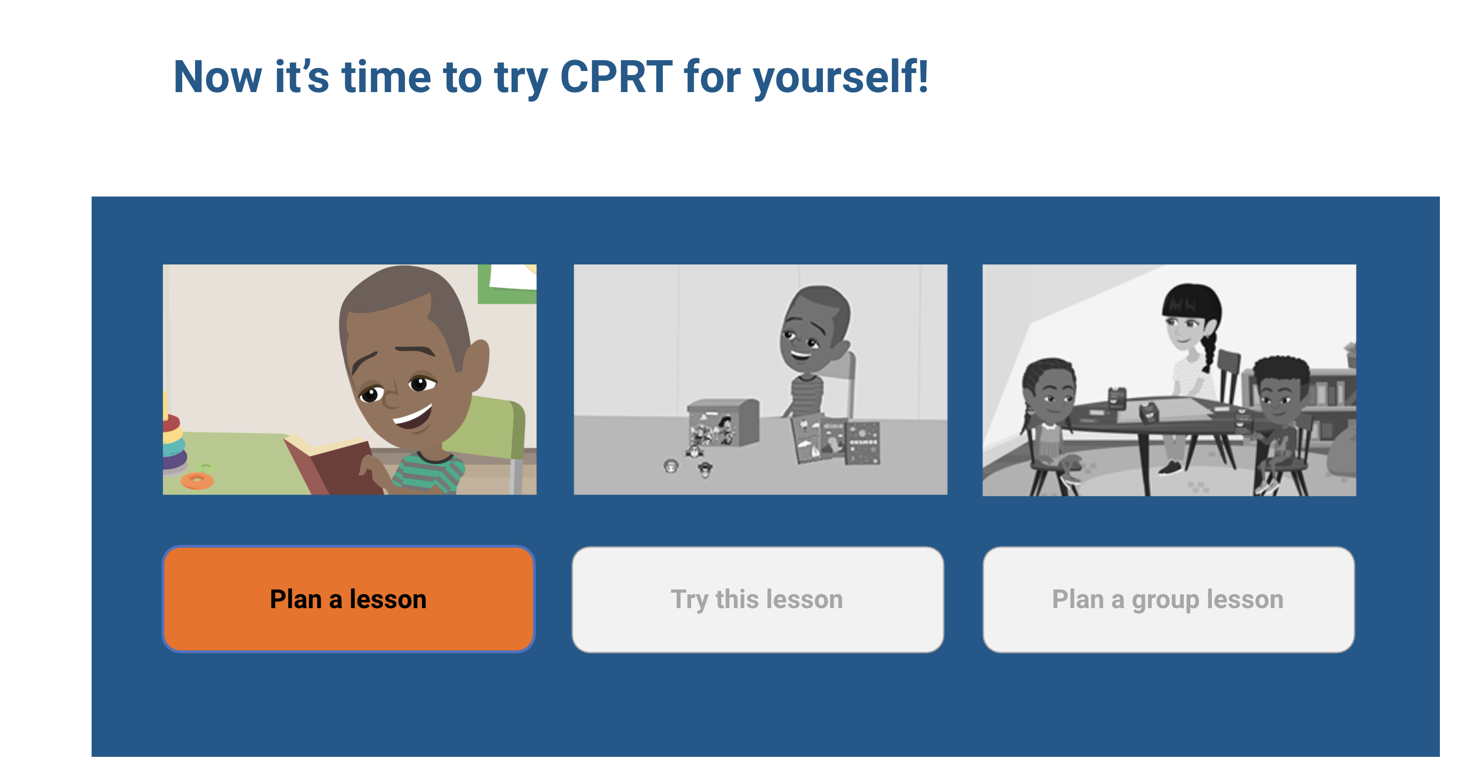
            { key: 'cprt', image: 'assets/cprt-screenshot.png', title: 'CPRT Implementation Product Suite', edge: T.c1, surface: T.s1, description: 'Blended learning product suite to support teachers to use and appropriately adapt the Classroom Pivotal Response Teaching (CPRT) autism intervention.' },
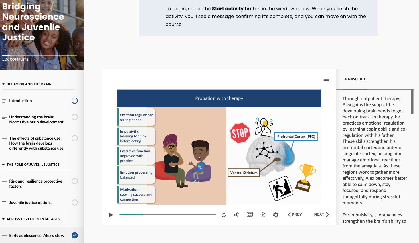
            { key: 'bridging', image: 'assets/bridging-workshop.jpg', title: 'Bridging Neuroscience and Juvenile Justice', edge: T.c4, surface: T.s4, description: 'Blended curriculum pilot translating neuroscience for use during workflow decision-making among juvenile justice professionals.' },
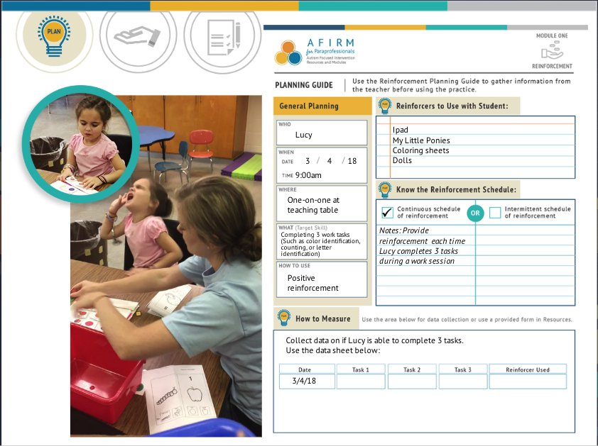
            { key: 'afirm', image: 'assets/afirm-screenshot.png', title: 'AFIRM for Paras', edge: T.c2, surface: T.s2, description: 'Universally available, hands-on online professional development that trains paraprofessionals to implement evidence-based practices with children with autism.' },
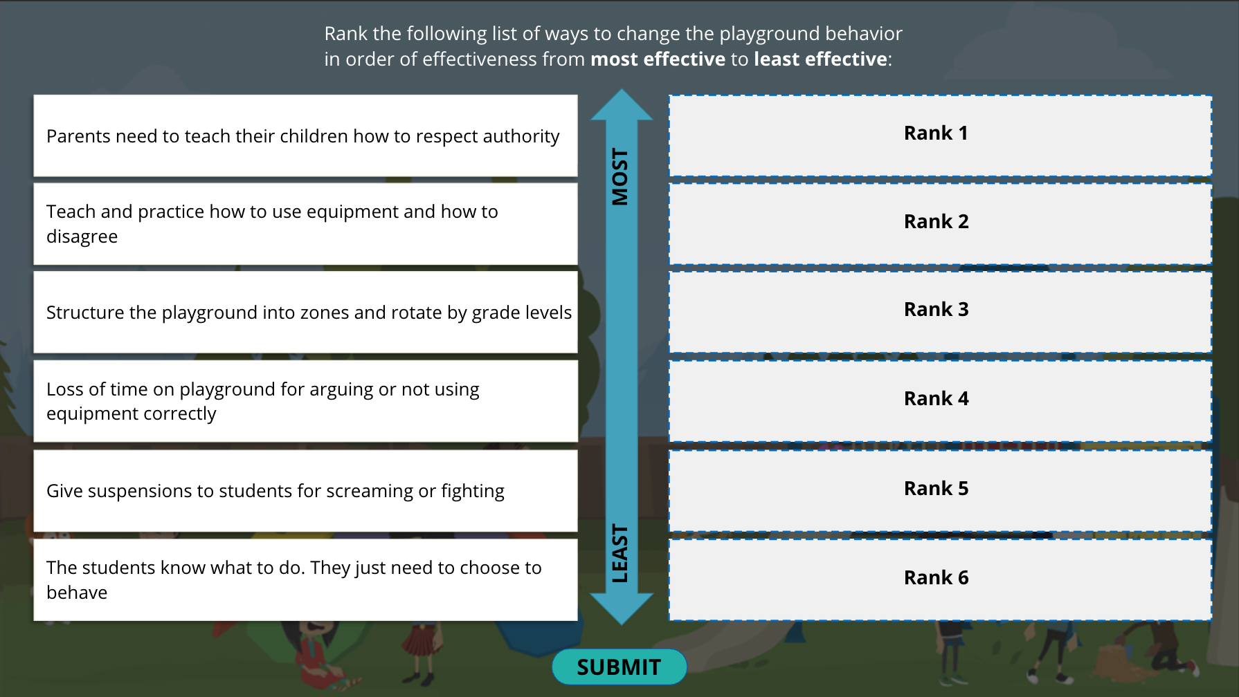
            { key: 'pbis', image: 'assets/pbis-tile.png', title: 'Michigan PBIS Implementation', edge: T.c3, surface: T.s3, description: 'Blended program supporting Schoolwide Positive Behavioral Interventions and Supports (SWPBIS) in Michigan schools, pairing a branching-scenario digital lesson with data-driven, customized supports for leadership teams.' },
          ].map((p) => (
            <RelevantProductCard key={p.key} ctx={ctx} go={go} image={p.image} alt={p.title} edge={p.edge} surface={p.surface}
              title={p.title} description={p.description}
              links={[{ label: 'Learn more', internal: { page: 'detail', key: p.key } }]} />
          ))}
        </div>
      </section>
    </main>
  );
}

// ─── 2b Product Development ───────────────────────────────────
function ProductDevDetail({ go, ctx }) {
  return (
    <main style={{ padding: ctx.isMobile ? '24px 20px 0' : '32px 64px 0' }}>
      <DetailBreadcrumb go={go} ctx={ctx} target="skills" label="Selected Skills" />
      <SkillHero
        ctx={ctx}
        image="assets/scildd-process.png"
        alt="SCILDD process diagram: Needs Analysis → Strategy → Design → Development → Implementation & Evaluation, framed by the three phases Proof of Concept, Proof of Product, Proof of Application"
        title="Design & Development"
        edge={T.c2} surface={T.s2}>
        <p style={{ fontFamily: T.sans, fontSize: 18, lineHeight: 1.55, color: T.ink, margin: 0, textWrap: 'pretty' }}>
          I lead end-to-end development from discovery/needs analysis through co-created, iterative prototyping, to valid and meaningful evaluation. I don't just follow the latest process; I wrote it.
        </p>
      </SkillHero>

      <SkillPubsSection ctx={ctx}>
        <CitationItem>
          <strong style={{ fontWeight: 600 }}>Morgan, W.M.</strong>, Sam, A., Suhrheinrich, J., &amp; Chan, J. (2026). An initial application of SCILDD: A Strategic, Co-created, and Iterative Learning Design and Development process. <em>Educational Technology Research and Development.</em>{' '}
          <a href="https://doi.org/10.1007/s11423-026-10590-6"
            target="_blank" rel="noopener noreferrer" style={citeLink(T.c2)}>View ↗</a>
          {' '}
          <a href="https://rdcu.be/e0Oui" target="_blank" rel="noopener noreferrer" style={citeLink(T.c2)}>Free full text ↗</a>
        </CitationItem>
        <CitationItem>
          <strong style={{ fontWeight: 600 }}>Morgan, W.</strong> (2026, November). <em>Designing a Neuroeducation Curriculum for Juvenile Justice Professionals: A SCILDD Process Case Illustration.</em> Accepted as concurrent presentation to the Association for Educational Communications and Technology (AECT) International Convention, Chicago, IL.
        </CitationItem>
        <CitationItem>
          <strong style={{ fontWeight: 600 }}>Morgan, W.</strong> (June, 2020). <em>The Science of Instructional Strategy.</em> <em>Learning Solutions Magazine,</em> eLearning Guild.{' '}
          <a href="https://learningsolutionsmag.com/articles/the-science-of-instructional-strategy"
            target="_blank" rel="noopener noreferrer" style={citeLink(T.c2)}>View ↗</a>
        </CitationItem>
      </SkillPubsSection>

      <SkillProductsSection ctx={ctx}>
        <RelevantProductCard ctx={ctx} go={go}
          image="assets/cprt-screenshot.png"
          alt="Welcome screen of the CPRT Individualization Tool"
          title="CPRT Implementation Product Suite"
          description="Blended learning product suite to support teachers to use and appropriately adapt the Classroom Pivotal Response Teaching (CPRT) autism intervention."
          edge={T.c1} surface={T.s1}
          links={[
            { label: 'Individualization Tool', url: 'https://classroomcprt.sdsu.edu/decision/story.html', external: true },
            { label: 'Interactive Case Study', url: 'https://classroomcprt.sdsu.edu/interactive.html', external: true },
            { label: 'Comprehensive Reference Guide', url: 'https://classroomcprt.sdsu.edu/rise/', external: true },
            { label: 'Learn more', internal: { page: 'detail', key: 'cprt' } },
          ]}
        />
        <RelevantProductCard ctx={ctx} go={go}
          image="assets/bridging-workshop.jpg"
          alt="Wendy Morgan presenting at the Bridging Neuroscience workshop"
          title="Bridging Neuroscience and Juvenile Justice"
          description="Blended curriculum pilot translating neuroscience for use during workflow decision-making among juvenile justice professionals."
          edge={T.c4} surface={T.s4}
          links={[
            { label: 'Go to project', url: 'https://www.sog.unc.edu/resources/microsites/juvenile-law/training-materials-relating-juvenile-justice', external: true },
            { label: 'Learn more', internal: { page: 'detail', key: 'bridging' } },
          ]}
        />
      </SkillProductsSection>
    </main>
  );
}

// ─── 2c Behavioral Science ────────────────────────────────────
function BehavioralScienceDetail({ go, ctx }) {
  const s = SKILLS.find((x) => x.key === 'research');
  return (
    <main style={{ padding: ctx.isMobile ? '24px 20px 0' : '32px 64px 0' }}>
      <DetailBreadcrumb go={go} ctx={ctx} target="skills" label="Selected Skills" />
      <SkillHero
        ctx={ctx}
        image="assets/behavioral-science.png"
        alt="Illustration of a large head in profile filled with a data donut chart, with people climbing ladders and analyzing charts and gears around it"
        title="Behavioral Science"
        edge={s.edge} surface={s.surface}>
        <p style={{ fontFamily: T.sans, fontSize: 18, lineHeight: 1.55, color: T.ink, margin: 0, textWrap: 'pretty' }}>
          {s.blurb}
        </p>
      </SkillHero>

      <SkillPubsSection ctx={ctx}>
        {PUB_WRITINGS.filter((_, i) => [0, 5, 6, 7].includes(i)).map((w, i) => (
          <CitationItem key={i}>
            {w.body}
            {w.link && (
              <>
                {' '}
                <a href={w.link.url} target="_blank" rel="noopener noreferrer" style={citeLink(s.edge)}>
                  {w.link.label} ↗
                </a>
              </>
            )}
          </CitationItem>
        ))}
      </SkillPubsSection>

      <SkillProductsSection ctx={ctx}>
        <RelevantProductCard ctx={ctx} go={go}
          image="assets/bridging-workshop.jpg"
          alt="Wendy Morgan presenting at the Bridging Neuroscience workshop"
          title="Bridging Neuroscience and Juvenile Justice"
          description="Blended curriculum pilot translating neuroscience for use during workflow decision-making among juvenile justice professionals."
          edge={T.c4} surface={T.s4}
          links={[
            { label: 'Go to project', url: 'https://www.sog.unc.edu/resources/microsites/juvenile-law/training-materials-relating-juvenile-justice' },
            { label: 'Learn more', internal: { page: 'detail', key: 'bridging' } },
          ]}
        />
        <RelevantProductCard ctx={ctx} go={go}
          image="assets/cprt-screenshot.png"
          alt="Welcome screen of the CPRT Individualization Tool"
          title="CPRT Implementation Product Suite"
          description="Blended learning product suite to support teachers to use and appropriately adapt the Classroom Pivotal Response Teaching (CPRT) autism intervention."
          edge={T.c1} surface={T.s1}
          links={[
            { label: 'Individualization Tool', url: 'https://classroomcprt.sdsu.edu/decision/story.html', external: true },
            { label: 'Interactive Case Study', url: 'https://classroomcprt.sdsu.edu/interactive.html', external: true },
            { label: 'Comprehensive Reference Guide', url: 'https://classroomcprt.sdsu.edu/rise/', external: true },
            { label: 'Learn more', internal: { page: 'detail', key: 'cprt' } },
          ]}
        />
        <RelevantProductCard ctx={ctx} go={go}
          image="assets/afirm-screenshot.png"
          alt="AFIRM for Paras, Module 1: Reinforcement"
          title="AFIRM for Paras"
          description="Autism Focused Intervention Resources and Modules (AFIRM): hands-on online professional development that trains paraprofessionals to implement evidence-based practices with children with autism."
          edge={T.c2} surface={T.s2}
          links={[
            { label: 'Go to project', url: 'https://afirm.fpg.unc.edu/afirm-modules/afirm-for-paraprofessionals/' },
            { label: 'Learn more', internal: { page: 'detail', key: 'afirm' } },
          ]}
        />
        <RelevantProductCard ctx={ctx} go={go}
          image="assets/pbis-tile.png"
          alt="Michigan PBIS Implementation"
          title="Michigan PBIS Implementation"
          description="Blended program supporting Schoolwide Positive Behavioral Interventions and Supports (SWPBIS) in Michigan schools, pairing a branching-scenario digital lesson with data-driven, customized supports for leadership teams."
          edge={T.c3} surface={T.s3}
          links={[
            { label: 'Learn more', internal: { page: 'detail', key: 'pbis' } },
          ]}
        />
      </SkillProductsSection>
    </main>
  );
}

// ─── Stub for skills without copy yet (2c, 2d) ────────────────
function SkillStub({ go, ctx, skillKey }) {
  const s = SKILLS.find((x) => x.key === skillKey);
  if (!s) return null;
  return (
    <main style={{ padding: ctx.isMobile ? '24px 20px 0' : '32px 64px 0' }}>
      <DetailBreadcrumb go={go} ctx={ctx} target="skills" label="Selected Skills" />
      {s.image && s.blurb ? (
        <>
        <SkillHero
          ctx={ctx}
          image={s.image}
          alt={`Illustration representing ${s.label}`}
          title={s.label}
          frameAspect={s.frameAspect}
          objectFit={s.objectFit}
          edge={s.edge} surface={s.surface}>
          <p style={{ fontFamily: T.sans, fontSize: 18, lineHeight: 1.55, color: T.ink, margin: 0, textWrap: 'pretty' }}>
            {s.blurb}
          </p>
        </SkillHero>
        {s.pubs && (
          <SkillPubsSection ctx={ctx}>
            {s.pubs.map((p, i) => (
              <CitationItem key={i}>
                <span dangerouslySetInnerHTML={{ __html: p.html }} />
              </CitationItem>
            ))}
          </SkillPubsSection>
        )}
        {s.projects && (
          <section style={{
            paddingTop: ctx.isMobile ? 32 : 48, paddingBottom: ctx.isMobile ? 40 : 56,
            borderTop: `1px solid ${T.rule}`,
          }}>
            <div style={{ fontFamily: T.sans, fontSize: 12, color: T.inkMute, marginBottom: 24, letterSpacing: 0.3, textTransform: 'uppercase', fontWeight: 500 }}>
              Relevant projects
            </div>
            <div style={{ display: 'grid', gap: ctx.isMobile ? 16 : 20 }}>
              {s.projects.map((p) => (
                <RelevantProductCard key={p.key} ctx={ctx} go={go} edge={p.edge} surface={p.surface}
                  image={p.image} alt={p.title}
                  title={p.title} description={p.description}
                  links={[{ label: 'Learn more', internal: { page: 'detail', key: p.key } }]} />
              ))}
            </div>
          </section>
        )}
        </>
      ) : (
        <>
        <section style={{ paddingBottom: 56, maxWidth: 1100 }}>
          <h1 style={{
            fontFamily: T.display,
            fontSize: ctx.isMobile ? 40 : 'clamp(48px, 5.8vw, 84px)',
            lineHeight: 1.05, letterSpacing: -1.4, fontWeight: 400,
            margin: 0, color: T.ink, textWrap: 'balance',
          }}>{s.label}</h1>
        </section>
      {s.blurb ? (
        <section style={{ paddingBottom: ctx.isMobile ? 40 : 56, maxWidth: 920 }}>
          <p style={{
            fontFamily: T.display, fontSize: ctx.isMobile ? 24 : 'clamp(26px, 2.6vw, 36px)',
            lineHeight: 1.3, letterSpacing: -0.4, fontWeight: 400, color: T.ink, margin: 0, textWrap: 'pretty',
          }}>{s.blurb}</p>
          <div aria-hidden="true" style={{ width: 64, height: 4, background: s.edge, borderRadius: 2, marginTop: 28 }} />
        </section>
      ) : (
        <section style={{
          background: s.surface, borderRadius: 4, padding: ctx.isMobile ? '32px 28px' : '48px 56px',
          borderLeft: `3px solid ${s.edge}`,
        }}>
          <div style={{ fontFamily: T.sans, fontSize: 12, color: s.edge, fontWeight: 600, letterSpacing: 0.5, textTransform: 'uppercase', marginBottom: 12 }}>
            Coming soon
          </div>
          <p style={{ fontFamily: T.sans, fontSize: 17, lineHeight: 1.6, color: T.ink, margin: 0, maxWidth: 640, textWrap: 'pretty' }}>
            Full skill detail, publications, and relevant products to follow.
          </p>
        </section>
      )}
      </>
      )}
    </main>
  );
}

// ─── Shared section frames for skill pages ────────────────────
function SkillPubsSection({ ctx, children }) {
  return (
    <section style={{
      paddingTop: ctx.isMobile ? 24 : 32, paddingBottom: ctx.isMobile ? 24 : 32,
      borderTop: `1px solid ${T.rule}`,
    }}>
      <div style={{ fontFamily: T.sans, fontSize: 12, color: T.inkMute, marginBottom: 12, letterSpacing: 0.3, textTransform: 'uppercase', fontWeight: 500 }}>
        Relevant publications and presentations
      </div>
      <ul style={{ listStyle: 'none', margin: 0, padding: 0 }}>
        {React.Children.map(children, (c, i) => (
          <li key={i} style={{
            padding: '12px 0',
            borderBottom: i < React.Children.count(children) - 1 ? `1px solid ${T.rule}` : 'none',
            fontFamily: T.sans, fontSize: 14, lineHeight: 1.55, color: T.ink, textWrap: 'pretty',
          }}>{c}</li>
        ))}
      </ul>
    </section>
  );
}

function SkillProductsSection({ ctx, children }) {
  return (
    <section style={{
      paddingTop: ctx.isMobile ? 24 : 32, paddingBottom: ctx.isMobile ? 32 : 48,
      borderTop: `1px solid ${T.rule}`,
    }}>
      <div style={{ fontFamily: T.sans, fontSize: 12, color: T.inkMute, marginBottom: 18, letterSpacing: 0.3, textTransform: 'uppercase', fontWeight: 500 }}>
        Relevant projects
      </div>
      <div style={{ display: 'grid', gap: ctx.isMobile ? 16 : 20 }}>
        {children}
      </div>
    </section>
  );
}

function CitationItem({ children }) {
  return <>{children}</>;
}

function citeLink(color, bold = false) {
  return {
    color, textDecoration: 'none', borderBottom: `1px solid ${color}`,
    paddingBottom: 1, wordBreak: 'break-word', fontWeight: bold ? 500 : 400,
  };
}

// Relevant-product card: photo (left) + content (right).
// Each link is rendered as a small tile. Internal links route via go().
function RelevantProductCard({ ctx, go, image, alt, title, description, citations, bullets, edge, surface, links }) {
  return (
    <article style={{
      display: 'grid',
      gridTemplateColumns: ctx.isMobile ? '1fr' : (image ? 'minmax(0, 360px) 1fr' : '1fr'),
      gap: ctx.isMobile ? 20 : 32,
      padding: ctx.isMobile ? 20 : 24,
      background: surface, borderRadius: 6, borderLeft: `3px solid ${edge}`,
    }}>
      {image && (
      <div style={{
        background: '#fff', borderRadius: 4, overflow: 'hidden',
        outline: `1px solid ${T.rule}`,
        aspectRatio: '16/10',
        display: 'flex', alignItems: 'center', justifyContent: 'center',
      }}>
        <img src={image} alt={alt || ''} loading="lazy"
          style={{ width: '100%', height: '100%', objectFit: 'contain', display: 'block' }} />
      </div>
      )}
      <div>
        <div style={{
          fontFamily: T.display, fontSize: ctx.isMobile ? 26 : 30, lineHeight: 1.1,
          letterSpacing: -0.5, fontWeight: 400, color: T.ink, marginBottom: description ? 8 : 14, textWrap: 'balance',
        }}>{title}</div>
        {description && (
          <p style={{ fontFamily: T.sans, fontSize: 15, lineHeight: 1.55, color: T.ink, margin: '0 0 16px', textWrap: 'pretty' }}>
            {description}
          </p>
        )}
        {bullets && bullets.length > 0 && (
          <ul style={{ listStyle: 'none', margin: '0 0 16px', padding: 0, display: 'grid', gap: 0 }}>
            {bullets.map((b, i) => <PhaseItem key={i} item={b} color={edge} depth={0} />)}
          </ul>
        )}
        {citations && citations.length > 0 && (
          <ul style={{ listStyle: 'none', margin: '0 0 16px', padding: 0, display: 'grid', gap: 14 }}>
            {citations.map((c, i) => {
              // citation can be a JSX node OR { citation, productUrl, productLabel }
              const isObj = c && typeof c === 'object' && !React.isValidElement(c) && 'citation' in c;
              const body = isObj ? c.citation : c;
              return (
                <li key={i} style={{
                  fontFamily: T.sans, fontSize: 13, lineHeight: 1.6, color: T.inkSoft,
                  textWrap: 'pretty', paddingLeft: 14, position: 'relative',
                }}>
                  <span aria-hidden="true" style={{
                    position: 'absolute', left: 0, top: '0.55em',
                    width: 5, height: 5, borderRadius: '50%', background: edge,
                  }} />
                  {body}
                  {isObj && c.productUrl && (
                    <>
                      {' '}
                      <a href={c.productUrl} target="_blank" rel="noopener noreferrer"
                        style={{
                          color: edge, fontWeight: 500, textDecoration: 'none',
                          borderBottom: `1px solid ${edge}`, paddingBottom: 1,
                          wordBreak: 'break-word',
                        }}>
                        {c.productLabel || 'Go to project'} ↗
                      </a>
                    </>
                  )}
                </li>
              );
            })}
          </ul>
        )}
        {links && links.length > 0 && (
          <div style={{ display: 'flex', flexWrap: 'wrap', gap: 8 }}>
            {links.map((l, i) => (
              l.disabled ? (
                <span key={i} style={{
                  fontFamily: T.sans, fontSize: 13, fontWeight: 500, color: T.inkSoft,
                  background: 'transparent', border: `1px solid ${T.rule}`, borderRadius: 999,
                  padding: '8px 14px', minHeight: 36, display: 'inline-flex', alignItems: 'center',
                }}>{l.label}</span>
              ) : l.internal ? (
                <button key={i} onClick={() => go(l.internal.page, l.internal.key)}
                  style={skillCardLink(edge)}>
                  {l.label} <span aria-hidden="true" style={{ marginLeft: 4 }}>→</span>
                </button>
              ) : (
                <a key={i} href={l.url} target="_blank" rel="noopener noreferrer"
                  style={{ ...skillCardLink(edge), textDecoration: 'none' }}>
                  {l.label} <span aria-hidden="true" style={{ marginLeft: 4 }}>↗</span>
                </a>
              )
            ))}
          </div>
        )}
      </div>
    </article>
  );
}

function skillCardLink(edge) {
  return {
    fontFamily: T.sans, fontSize: 13, fontWeight: 500, color: '#fff',
    background: edge, border: 'none', borderRadius: 999,
    padding: '8px 14px', minHeight: 36, cursor: 'pointer',
    display: 'inline-flex', alignItems: 'center',
  };
}

// ─────────── PUBLICATIONS ───────────
// Two groups: Publications (writing, chapters, talks, media) and
// Digital products (online learning objects). Each entry is verbatim from the
// user's list. Journal/magazine/blog/book/podcast names and standalone-work
// titles use <em> per the citation italics exception. Links use compact
// contextual labels rather than raw URLs to stay on-brand.
const PUB_WRITINGS = [
  {
    body: <><strong style={{ fontWeight: 600 }}>Morgan, W.M.</strong>, Sam, A., Suhrheinrich, J., &amp; Chan, J. (Advance online publication: January 26, 2026). An initial application of SCILDD: A Strategic, Co-created, and Iterative Learning Design and Development process. <em>Educational Technology Research and Development.</em></>,
    link: { label: 'DOI', url: 'https://doi.org/10.1007/s11423-026-10590-6' },
    year: 2026,
  },
  {
    body: <><strong style={{ fontWeight: 600 }}>Morgan, W.</strong> (2023). "Behind the Scenes of the AI Hub…". <em>Practicing Implementation Blog.</em></>,
    link: { label: 'View', url: 'https://nirn.fpg.unc.edu/blog/behind-the-scenes-of-the-ai-hub/' },
    year: 2023,
  },
  {
    body: <><strong style={{ fontWeight: 600 }}>Morgan, W.</strong> (2023). Using Data Across Blended Scenarios. In Torrance, M. <em>Data &amp; Analytics for Instructional Designers</em> (pp. 88–89). Association for Talent Development: Alexandria, VA.</>,
    year: 2023,
  },
  {
    body: <><strong style={{ fontWeight: 600 }}>Morgan, W.</strong> (2023). Working Within a Unique Learning Data Ecosystem. In Torrance, M. <em>Data &amp; Analytics for Instructional Designers</em> (pp. 160–161). Association for Talent Development: Alexandria, VA.</>,
    year: 2023,
  },
  {
    body: <>Interviewed in: Washburn, B. (Host). (2022, November 28). Using xAPI to Collect Data on Learning Programs (No. 132) [Audio podcast episode]. In <em>Train Like You Listen.</em> Spotify.</>,
    link: { label: 'Listen', url: 'https://open.spotify.com/episode/4MtoC6cxaZMBipLPD9jv7j?si=Yd-_K7dDT-qXpD3AspzIVQ' },
    year: 2022,
  },
  {
    body: <><strong style={{ fontWeight: 600 }}>Morgan, W.</strong> (August, 2022). A crucial blended learning tool: The traffic light dashboard. <em>Learning Solutions Magazine,</em> eLearning Guild.</>,
    link: { label: 'View', url: 'https://www.learningguild.com/articles/a-crucial-blended-learning-tool-the-traffic-light-dashboard' },
    year: 2022,
  },
  {
    body: <><strong style={{ fontWeight: 600 }}>Morgan, W.</strong> (June, 2020). The Science of Instructional Strategy. <em>Learning Solutions Magazine,</em> eLearning Guild.</>,
    link: { label: 'View', url: 'https://learningsolutionsmag.com/articles/the-science-of-instructional-strategy' },
    year: 2020,
  },
  {
    body: <><strong style={{ fontWeight: 600 }}>Morgan, W.</strong> (April 13, 2020). Blended Learning Strategy: COVID-19/Quarantine Approach. <em>Learning Solutions Magazine,</em> eLearning Guild.</>,
    link: { label: 'View', url: 'https://learningsolutionsmag.com/articles/blended-learning-strategy-trifecta-covid-19-quarantine-approach' },
    year: 2020,
  },
  {
    body: <><strong style={{ fontWeight: 600 }}>Morgan, W.</strong>, Kliewer, M., &amp; Torrance, M. (March 13, 2020). xAPI Strategy at Frank Porter Graham Child Development Institute. <em>Learning Solutions Magazine,</em> eLearning Guild.</>,
    link: { label: 'View', url: 'https://learningsolutionsmag.com/articles/xapi-strategy-at-frank-porter-graham-child-development-institute' },
    year: 2020,
  },
];

const PUB_CATEGORIES = [
  { key: 'writings', label: 'Publications', edge: T.c1, surface: T.s1, items: PUB_WRITINGS, icon: 'assets/icons/pubs2-tint.png',
    desc: 'Peer-reviewed articles, book chapters, and media features.' },
  { key: 'presentations', label: 'Presentations', edge: T.c2, surface: T.s2, items: window.PUB_PRESENTATIONS_DATA || [], icon: 'assets/icons/pubs-tint.png',
    desc: 'Conference talks, workshops, posters, and invited lectures.' },
  { key: 'products', label: 'Digital products', edge: T.c4, surface: T.s4, items: window.PUB_PRODUCTS_DATA || [], icon: 'assets/icons/digital-tint.png',
    desc: 'Interactive learning objects and online modules.' },
];

function Publications({ go, ctx }) {
  const [view, setView] = React.useState('index');
  const active = PUB_CATEGORIES.find((c) => c.key === view);

  if (active) {
    return (
      <main style={{ padding: ctx.isMobile ? '24px 20px 0' : '32px 64px 0' }}>
        <div style={{ marginBottom: ctx.isMobile ? 20 : 28, fontFamily: T.sans, fontSize: 13 }}>
          <button onClick={() => setView('index')} style={{
            background: 'none', border: 'none', cursor: 'pointer', padding: '8px 0',
            color: T.inkSoft, fontFamily: 'inherit', fontSize: 'inherit', minHeight: 36,
          }}>← Publications &amp; presentations</button>
        </div>
        <section style={{ paddingBottom: ctx.isMobile ? 8 : 16 }}>
          <div style={{ display: 'inline-flex', alignItems: 'center', gap: 10, marginBottom: 14 }}>
            <span aria-hidden="true" style={{ width: 28, height: 3, background: active.edge, borderRadius: 2 }} />
            <span style={{ fontFamily: T.sans, fontSize: 12, color: active.edge, letterSpacing: 0.4, textTransform: 'uppercase', fontWeight: 600 }}>
              {active.items.length} {active.items.length === 1 ? 'entry' : 'entries'}
            </span>
          </div>
          <h1 style={{
            fontFamily: T.display,
            fontSize: ctx.isMobile ? 40 : 'clamp(44px, 5.2vw, 72px)',
            lineHeight: 1.05, letterSpacing: -1.2, fontWeight: 400,
            margin: 0, color: T.ink, textWrap: 'balance',
          }}>{active.label}</h1>
          {active.key === 'presentations' && (
            <div style={{ marginTop: 14, fontFamily: T.sans, fontSize: 13, color: T.inkMute }}>
              <span style={{ color: active.edge, fontWeight: 600 }}>★</span> Invited presentation
            </div>
          )}
        </section>
        <PubYearList ctx={ctx} items={active.items} edge={active.edge} />
        <div style={{ display: 'flex', gap: 10, flexWrap: 'wrap', padding: `${ctx.isMobile ? 24 : 32}px 0 8px`, borderTop: `1px solid ${T.rule}`, marginTop: 8 }}>
          {PUB_CATEGORIES.filter((c) => c.key !== view).map((c) => (
            <button key={c.key} onClick={() => { setView(c.key); const el = document.getElementById('p-scroll'); if (el) el.scrollTop = 0; }}
              style={{
                fontFamily: T.sans, fontSize: 13, fontWeight: 500, color: T.ink, cursor: 'pointer',
                background: c.surface, border: 'none', borderRadius: 999, padding: '10px 18px',
                borderLeft: `3px solid ${c.edge}`, minHeight: 40,
              }}>
              {c.label} <span aria-hidden="true" style={{ color: c.edge, marginLeft: 4 }}>→</span>
            </button>
          ))}
        </div>
      </main>
    );
  }

  return (
    <main style={{ padding: ctx.isMobile ? '32px 20px 0' : '40px 64px 0' }}>
      <section style={{ paddingBottom: ctx.isMobile ? 28 : 40, maxWidth: 880 }}>
        <h1 style={{
          fontFamily: T.display,
          fontSize: ctx.isMobile ? 40 : 'clamp(48px, 5.6vw, 76px)',
          lineHeight: 1.05, letterSpacing: -1.2, fontWeight: 400,
          margin: 0, color: T.ink, textWrap: 'balance',
        }}>
          Publications, Presentations, &amp; Products
        </h1>
      </section>
      <section style={{
        display: 'grid',
        gridTemplateColumns: ctx.isMobile ? '1fr' : 'repeat(3, 1fr)',
        gap: ctx.isMobile ? 16 : 24, paddingBottom: 24,
      }}>
        {PUB_CATEGORIES.map((c) => (
          <PubCategoryCard key={c.key} c={c} ctx={ctx} onOpen={() => setView(c.key)} />
        ))}
      </section>
    </main>
  );
}

function PubCategoryCard({ c, ctx, onOpen }) {
  const [hov, setHov] = React.useState(false);
  return (
    <button
      onClick={onOpen}
      onMouseEnter={() => setHov(true)} onMouseLeave={() => setHov(false)}
      style={{
        textAlign: 'left', cursor: 'pointer',
        background: c.surface, color: T.ink, border: 'none', borderRadius: 6,
        padding: ctx.isMobile ? '32px 28px 28px 32px' : '40px 32px 32px 40px',
        minHeight: ctx.isMobile ? 200 : 280, position: 'relative', overflow: 'hidden',
        display: 'flex', flexDirection: 'column', justifyContent: 'space-between',
        fontFamily: T.sans,
        transform: hov ? 'translateY(-3px)' : 'translateY(0)',
        boxShadow: hov ? '0 18px 40px -20px rgba(28,26,23,0.18)' : '0 1px 2px rgba(28,26,23,0.04)',
        transition: 'transform .25s, box-shadow .25s',
      }}>
      <div aria-hidden="true" style={{ position: 'absolute', left: 0, top: 0, bottom: 0, width: 4, background: c.edge }} />
      <div>
        {c.icon && (
          <img src={c.icon} alt="" aria-hidden="true" style={{
            height: ctx.isMobile ? 38 : 44, width: 'auto', objectFit: 'contain',
            display: 'block', marginBottom: ctx.isMobile ? 16 : 22,
          }} />
        )}
        <div style={{
          fontFamily: T.display, fontSize: ctx.isMobile ? 30 : 36, lineHeight: 1.05,
          letterSpacing: -0.6, fontWeight: 400, color: T.ink, marginBottom: 12, textWrap: 'balance',
        }}>{c.label}</div>
        <div style={{ fontFamily: T.sans, fontSize: 14, lineHeight: 1.55, color: T.inkSoft, textWrap: 'pretty' }}>
          {c.desc}
        </div>
      </div>
      <div style={{ display: 'flex', alignItems: 'baseline', justifyContent: 'space-between', marginTop: 28 }}>
        <span style={{ fontFamily: T.display, fontSize: 40, lineHeight: 1, color: c.edge }}>
          {c.items.length}
        </span>
        <span style={{
          fontFamily: T.sans, fontSize: 13, color: c.edge, fontWeight: 500,
          display: 'flex', alignItems: 'center', gap: 8,
          transform: hov ? 'translateX(4px)' : 'translateX(0)', transition: 'transform .25s',
        }}>
          View all<span aria-hidden="true">→</span>
        </span>
      </div>
    </button>
  );
}

// Year-grouped list: left rail shows the year once per group.
function PubYearList({ ctx, items, edge }) {
  const years = [];
  const byYear = {};
  items.forEach((it) => {
    const y = it.year || 'Other';
    if (!(y in byYear)) { byYear[y] = []; years.push(y); }
    byYear[y].push(it);
  });
  years.sort((a, b) => b - a);
  return (
    <div>
      {years.map((y) => (
        <section key={y} style={{
          display: 'grid',
          gridTemplateColumns: ctx.isMobile ? '1fr' : '90px 1fr',
          gap: ctx.isMobile ? 4 : 24,
          paddingTop: ctx.isMobile ? 20 : 28,
          borderTop: `1px solid ${T.rule}`,
        }}>
          <div style={{
            fontFamily: T.display, fontSize: ctx.isMobile ? 22 : 28, color: edge,
            lineHeight: 1, paddingTop: ctx.isMobile ? 0 : 18,
            position: ctx.isMobile ? 'static' : 'sticky', top: 16, alignSelf: 'start',
            marginBottom: ctx.isMobile ? 8 : 0,
          }}>{y}</div>
          <ol style={{ listStyle: 'none', margin: 0, padding: 0 }}>
            {byYear[y].map((it, i) => (
              <PubItem key={i} it={it} edge={edge} ctx={ctx} last={i === byYear[y].length - 1} />
            ))}
          </ol>
        </section>
      ))}
    </div>
  );
}

function PubItem({ it, edge, ctx, last }) {
  return (
    <li style={{
      display: 'grid',
      gridTemplateColumns: ctx.isMobile ? '1fr' : '1fr auto',
      gap: ctx.isMobile ? 8 : 24, alignItems: 'baseline',
      padding: '18px 0',
      borderBottom: last ? 'none' : `1px solid ${T.rule}`,
    }}>
      <div style={{
        fontFamily: T.sans, fontSize: 15, lineHeight: 1.6, color: T.ink,
        textWrap: 'pretty', paddingLeft: 16, position: 'relative',
      }}>
        <span aria-hidden="true" style={{
          position: 'absolute', left: 0, top: '0.6em',
          width: 6, height: 6, borderRadius: '50%', background: edge,
        }} />
        {it.invited && <span aria-hidden="true" style={{ color: edge, fontWeight: 600 }}>★ </span>}
        {it.html ? <span dangerouslySetInnerHTML={{ __html: it.html }} /> : it.body}
      </div>
      {it.link ? (
        <a href={it.link.url} target="_blank" rel="noopener noreferrer"
          style={{
            fontFamily: T.sans, fontSize: 13, fontWeight: 500, color: '#fff',
            background: edge, borderRadius: 999, padding: '7px 14px',
            textDecoration: 'none', whiteSpace: 'nowrap', minHeight: 34,
            display: 'inline-flex', alignItems: 'center', justifySelf: ctx.isMobile ? 'start' : 'end',
          }}>
          {it.link.label} <span aria-hidden="true" style={{ marginLeft: 4 }}>↗</span>
        </a>
      ) : it.invited ? (
        <span style={{
          fontFamily: T.sans, fontSize: 11, fontWeight: 600, color: edge,
          letterSpacing: 0.4, textTransform: 'uppercase',
          border: `1px solid ${edge}`, borderRadius: 999, padding: '5px 12px',
          whiteSpace: 'nowrap', justifySelf: ctx.isMobile ? 'start' : 'end',
        }}>Invited</span>
      ) : null}
    </li>
  );
}

// ─────────── EXPERIENCE ───────────
const EXP_FUNDING = [
  { name: 'Innovative Disability Employment Advancement with Leading-edge Technology Promoting Accommodation Resources and Technology NEeds and Rights (IDEAL PARTNERs)', funder: 'United States Department of Health and Human Services, Administration for Community Living', pi: 'Brianne Tomaszewski, PhD' },
  { name: 'Bridging Neuroscience and Juvenile Justice through a Novel Neuroeducation Curriculum for Juvenile Justice Professionals', funder: 'Dana Foundation', pi: 'Aysenil Belger, PhD' },
  { name: 'State Implementation and Scaling-Up of Evidence-based Practices (SISEP) IV', funder: 'U.S. Department of Education', pi: 'Mel Livet, PhD' },
  { name: 'HEELS 2 Participation: Improving Community Participation for Young Adults With Intellectual Disabilities (HEELS2)', funder: 'United States Department of Health and Human Services, Administration for Community Living', pi: 'Dara Chan, PhD' },
  { name: 'Work Together NC Promoting Evidence-Based Practices for Employment to Achieve Competitive Integrated Employment', funder: 'NCDHHS Division of Mental Health, Developmental Disabilities and Substance Abuse Services (MHDDSAS)', pi: 'Brianne Tomaszewski, PhD' },
  { name: 'North Carolina Community Collaboration for Employment', funder: 'DHHS Administration for Community Living (ACL)', pi: 'Brianne Tomaszewski, PhD' },
  { name: 'An Evidence-Based, Virtual Toolkit for Community Mental Health Clinicians Serving Autistic Youth', funder: 'Organization for Autism Research', pi: 'Grace Lee Simmons, PhD' },
];

const EXP_ROLES = [
  {
    title: 'Lead, Strategic Innovation & Learning Design',
    title2: 'Senior Implementation Specialist',
    org: 'Frank Porter Graham Child Development Institute, UNC–Chapel Hill (FPG)',
    dates: 'October 2022 – present',
    groups: [
      { label: 'Leadership and Management', items: [
        `Directly supervise two instructional designers; manage project-based team that has flexed between three and eight people across a fully grant-funded environment`,
        `Manage vendor relationships including technology evaluation, selection, and contract management for instructional projects.`,
        `Co-create professional development and performance support frameworks in partnership with project leadership.`,
      ] },
      { label: 'Instructional Technology Systems and Innovation', items: [
        `Design and maintain xAPI/LRS-based blended learning infrastructure that feeds learner activity data into custom coach dashboards, enabling personalized synchronous follow-up`,
        `Lead micro-credentialing curriculum development integrating Canvas, Articulate-built courseware, and xAPI data reporting into a single learner experience.`,
        `Organized FPG-wide AI training and led team skill development; team now regularly designs and deploys AI chatbots as instructional tools.`,
      ], tools: `Articulate Storyline/Rise, Adobe Creative Cloud (InDesign, Premiere, Audition, Firefly, Acrobat), Vyond, Panopto, Canvas, xAPI/Learning Record Store (LRS), Qualtrics, Microsoft 365 (SharePoint, Teams, OneDrive), Copilot, Copilot Studio, Zoom, Google Workspace, VoiceOver` },
      { label: 'Design and Development', items: [
        `Lead design and development of 25+ learning products across complex, high-stakes content areas including implementation science, neuroeducation for juvenile justice professionals, and digital life skills for adults with intellectual and developmental disabilities.`,
        `Design blended learning strategies that integrate asynchronous and synchronous elements, including data collection and visualization infrastructure that makes blended learning measurably effective.`,
        `Developed and published SCILDD (Strategic, Co-created, and Iterative Learning Design and Development), a peer-reviewed design methodology published in Educational Technology Research & Development.`,
      ] },
    ],
  },
  {
    title: 'Learning and Development Senior Strategist',
    org: 'Frank Porter Graham Child Development Institute, UNC–Chapel Hill',
    dates: 'January 2016 – October 2022',
    items: [
      `Built FPG's externally-facing Learning and Development function from the ground up, growing from individual contributor to a team of eight through partnerships, collaborations, and grant proposals.`,
      `Pioneered FPG's xAPI/LRS infrastructure, making it possible for the first time to collect meaningful learner activity data from web-based training across multiple projects and audiences. Recognized with Brandon Hall Gold Award for Best Advance in Learning Management Technology.`,
      `Developed the blended learning model and coach dashboard approach that supports FPG projects across the portfolio.`,
      `Developed iterative co-design and development process that became the foundation for the SCILDD methodology.`,
      `Launched 50 digital learning products meeting or exceeding defined key success indicators. Recognized with five additional Brandon Hall awards across custom content and blended learning.`,
      `Co-founded internship program for students of North Carolina HBCUs.`,
    ],
  },
  {
    title: 'Independent Consultant, Learning Strategy and Design',
    org: 'Chapel Hill, NC',
    dates: 'August 2014 – present (concurrent with FPG roles)',
    items: [
      `Provide learning strategy, instructional design, and project management consultation to a range of clients across sectors.`,
      `Designed award-winning learning products for Studer Group (now Huron), a national healthcare leadership consulting firm. Recognized with three Brandon Hall awards for excellence in custom content.`,
      `Strong record of repeat clients and referral-based engagements.`,
    ],
  },
  {
    title: 'Instructional Designer and Visiting Lecturer',
    org: 'University of North Carolina at Chapel Hill',
    dates: 'January 2011 – July 2014',
    items: [
      `Designed, developed, and implemented instruction for small and large classes (20-180).`,
      `Managed and supervised five assistants.`,
      `Redesigned static text online course by designing, development, and implementing modules with interactive activities, animation, and live surveying.`,
    ],
  },
];

const EXP_AWARDS = [
  { year: '2026', text: `Translating Innovative Ideas for the Public Good Award from Innovate Carolina UNC for AccessPlay AI: Empowering Early Childhood Educators to Create Inclusive Learning (PI: Yang)` },
  { year: '2024', text: `Cloud Resource Grant from the UNC Provost Artificial Intelligence Acceleration Program` },
  { year: '2022', text: `C. Felix Harvey Award from UNC's Office of the Provost in recognition of innovative scholarship that directly and positively impacts constituencies outside the university (PI: Corsello)` },
  { year: '2022', text: `Brandon Hall Bronze Award for Excellence in Learning and Development: Best Use of Blended Learning`, bh: true },
  { year: '2021', text: `Brandon Hall Silver Award for Excellence in Learning and Development: Best Advance in Custom Content`, bh: true },
  { year: '2021', text: `Excellence in Practice: Trailblazer Award from Learning Reimagined` },
  { year: '2020', text: `Brandon Hall Bronze Award for Excellence in Learning and Development: Best Use of Blended Learning`, bh: true },
  { year: '2019', text: `Brandon Hall Silver Award for Excellence in Learning and Development: Best Advance in Custom Content`, bh: true },
  { year: '2018', text: `Brandon Hall Gold Award for Excellence in Technology: Best Advance in Learning Management Technology for External Training`, bh: true },
  { year: '2018', text: `UNC Diversity Award for Intergroup Collaboration (FPG'S RACE Committee)` },
  { year: '2017', text: `Brandon Hall Bronze Award for Excellence in Learning and Development: Best Advance in Custom Content`, bh: true },
  { year: '2016', text: `Brandon Hall Gold Award for Excellence in Learning and Development: Best Advance in Custom Content`, bh: true },
  { year: '2016', text: `Brandon Hall Bronze Award for Excellence in Learning and Development: Best Use of Blended Learning`, bh: true },
  { year: '2015', text: `Brandon Hall Silver Award for Excellence in Learning and Development: Best Advance in Custom Content`, bh: true },
];

const EXP_AWARD_IMAGES = [
  { src: 'assets/awards/bh-2015-silver.png', year: '2015', label: 'Brandon Hall Silver · Excellence in Learning' },
  { src: 'assets/awards/bh-2016-gold.png', year: '2016', label: 'Brandon Hall Gold · Excellence in Learning' },
  { src: 'assets/awards/bh-2016-bronze.png', year: '2016', label: 'Brandon Hall Bronze · Excellence in Learning' },
  { src: 'assets/awards/bh-2017-bronze.png', year: '2017', label: 'Brandon Hall Bronze · Excellence in Learning' },
  { src: 'assets/awards/bh-2018-gold-tech.png', year: '2018', label: 'Brandon Hall Gold · Excellence in Technology' },
  { src: 'assets/awards/bh-2019-silver.png', year: '2019', label: 'Brandon Hall Silver · Excellence in Learning' },
  { src: 'assets/awards/bh-2020-bronze.png', year: '2020', label: 'Brandon Hall Bronze · Excellence in Learning' },
  { src: 'assets/awards/bh-2021-silver.png', year: '2021', label: 'Brandon Hall Silver · Excellence in Learning' },
  { src: 'assets/awards/trailblazer-2021.jpg', year: '2021', label: 'Learning Reimagined · Trailblazer' },
  { src: 'assets/awards/bh-2022-bronze.png', year: '2022', label: 'Brandon Hall Bronze · Learning & Development' },
  { seal: 'harvey', name: 'C. Felix Harvey Award', year: '2022', label: 'C. Felix Harvey Award · UNC–Chapel Hill' },
  { seal: 'tiip', name: 'TIIP Award', year: '2026', label: 'TIIP Award · Innovate Carolina, UNC' },
];

// UNC-brand award seal: interlocking NC logo + Oswald (Field Gothic alt) name.
const UNC_NAVY = '#13294B';
function UncSeal({ name, diameter }) {
  return (
    <div style={{
      width: diameter, height: diameter, borderRadius: '50%',
      border: `3px solid ${UNC_NAVY}`, background: '#eef4fb',
      boxShadow: `inset 0 0 0 1px rgba(19,41,75,0.18)`,
      display: 'flex', flexDirection: 'column', alignItems: 'center', justifyContent: 'center',
      gap: diameter * 0.05, padding: diameter * 0.12, boxSizing: 'border-box', textAlign: 'center',
    }}>
      <img src="assets/awards/unc-nc.png" alt="" aria-hidden="true"
        style={{ height: diameter * 0.26, width: 'auto', objectFit: 'contain' }} />
      <div style={{
        fontFamily: '"Oswald", "Arial Narrow", sans-serif', fontWeight: 700,
        textTransform: 'uppercase', color: UNC_NAVY,
        fontSize: diameter * 0.105, lineHeight: 1.06, letterSpacing: 0.4,
      }}>{name}</div>
    </div>
  );
}

const EXP_EDUCATION = [
  { degree: 'Ph.D.', school: 'Purdue University', field: 'Interpersonal & Family Communication / Developmental Psychology' },
  { degree: 'M.A.', school: 'Northwestern University', field: 'Mass Communication' },
  { degree: 'B.S.', school: 'James Madison University', field: 'Communication (double major): Visual Communication and Journalism', note: 'Valedictorian, School of Media Arts & Design' },
];

const EXP_CERTS = [
  { text: `Digital Accessibility Liaisons Badge, University of North Carolina – NC TraCS: May, 2026`, url: 'https://www.credly.com/badges/5513be5f-d5fc-4e1d-92b2-88cf2f667ded/linked_in_profile' },
  { text: `Registered Circle of Security Parent Facilitator: March, 2026`, url: 'https://5347660.app.netsuite.com/core/media/media.nl?id=3013759&c=5347660&h=iwF0gikPXtXF2bRn5GRNZhWCTVMfZqRJkrkGZDkEU2snPrus&_xt=.pdf' },
  { text: `CITI Program Certification: Social and Behavioral Research: January, 2024`, url: 'https://www.citiprogram.org/verify/?wd6e814c8-8765-444b-b0de-9aba07109d40-60147379' },
  { text: `CITI Program Certification: Human Subjects Research: January, 2024`, url: 'https://www.citiprogram.org/verify/?w5347f46e-f535-498f-8a7e-cb9d47aab8e0-60147380' },
];

function Experience({ go, ctx }) {
  const pad = ctx.isMobile ? '32px 20px 0' : '40px 64px 0';
  return (
    <main style={{ padding: pad }}>
      <section style={{ paddingBottom: ctx.isMobile ? 24 : 32, maxWidth: 1040 }}>
        <h1 style={{
          fontFamily: T.display,
          fontSize: ctx.isMobile ? 40 : 'clamp(48px, 5.6vw, 76px)',
          lineHeight: 1.05, letterSpacing: -1.2, fontWeight: 400,
          margin: 0, color: T.ink, textWrap: 'balance',
        }}>
          Awards & Experience
        </h1>
        <p style={{
          fontFamily: T.sans, fontSize: ctx.isMobile ? 17 : 19, lineHeight: 1.55,
          color: T.ink, margin: '18px 0 0', textWrap: 'pretty',
        }}>
          I build impactful projects and the systems behind them: the function, the infrastructure, and the strategy.
        </p>
      </section>

      {/* Award badges carousel */}
      <section style={{ paddingBottom: ctx.isMobile ? 24 : 32 }}>
        <AwardsCarousel ctx={ctx} />
      </section>

      {/* Funding (left, sticky) + Roles (right) */}
      <section style={{
        display: 'grid',
        gridTemplateColumns: ctx.isMobile ? '1fr' : '0.62fr 1fr',
        gap: ctx.isMobile ? 40 : 64,
        alignItems: 'start',
        borderTop: `1px solid ${T.rule}`,
        paddingTop: ctx.isMobile ? 28 : 40,
      }}>
        {/* LEFT: funding */}
        <div style={ctx.isMobile ? {} : { position: 'sticky', top: 16 }}>
          <div style={{ fontFamily: T.sans, fontSize: 12, color: T.inkMute, marginBottom: 18, letterSpacing: 0.3, textTransform: 'uppercase', fontWeight: 500 }}>
            Current funding activity
          </div>
          <ul style={{ listStyle: 'none', margin: 0, padding: 0, display: 'grid', gap: 12 }}>
            {EXP_FUNDING.map((f, i) => (
              <li key={i} style={{
                background: T.s2, borderRadius: 6, borderLeft: `3px solid ${T.c2}`,
                padding: ctx.isMobile ? '16px 18px' : '18px 20px',
              }}>
                <div style={{ fontFamily: T.sans, fontSize: 14, lineHeight: 1.45, color: T.ink, fontWeight: 600, marginBottom: 8, textWrap: 'pretty' }}>
                  {f.name}
                </div>
                <div style={{ fontFamily: T.sans, fontSize: 12.5, lineHeight: 1.5, color: T.inkSoft, textWrap: 'pretty' }}>
                  {f.funder}
                </div>
                <div style={{ fontFamily: T.sans, fontSize: 12.5, lineHeight: 1.5, color: T.c2, fontWeight: 500, marginTop: 4 }}>
                  PI: {f.pi}
                </div>
              </li>
            ))}
          </ul>
        </div>

        {/* RIGHT: roles timeline */}
        <div>
          <div style={{ fontFamily: T.sans, fontSize: 12, color: T.inkMute, marginBottom: 18, letterSpacing: 0.3, textTransform: 'uppercase', fontWeight: 500 }}>
            Roles
          </div>
          <ol style={{ listStyle: 'none', margin: 0, padding: 0 }}>
            {EXP_ROLES.map((r, i) => (
              <RoleItem key={i} r={r} ctx={ctx} last={i === EXP_ROLES.length - 1} />
            ))}
          </ol>
        </div>
      </section>

      {/* Honors & awards */}
      <section style={{
        paddingTop: ctx.isMobile ? 32 : 48, paddingBottom: ctx.isMobile ? 8 : 16,
        borderTop: `1px solid ${T.rule}`, marginTop: ctx.isMobile ? 32 : 48,
      }}>
        <div style={{ display: 'flex', alignItems: 'baseline', justifyContent: 'space-between', gap: 16, flexWrap: 'wrap', marginBottom: 24 }}>
          <div style={{ fontFamily: T.sans, fontSize: 12, color: T.inkMute, letterSpacing: 0.3, textTransform: 'uppercase', fontWeight: 500 }}>
            Honors &amp; awards
          </div>
          <div style={{ display: 'flex', alignItems: 'baseline', gap: 24, flexWrap: 'wrap' }}>
            <div style={{ display: 'flex', alignItems: 'baseline', gap: 10 }}>
              <span style={{ fontFamily: T.display, fontSize: ctx.isMobile ? 32 : 40, lineHeight: 1, color: T.c4 }}>Nine</span>
              <span style={{ fontFamily: T.sans, fontSize: 13, color: T.inkSoft }}>Brandon Hall Awards</span>
            </div>
            <div style={{ display: 'flex', alignItems: 'baseline', gap: 10 }}>
              <span style={{ fontFamily: T.display, fontSize: ctx.isMobile ? 32 : 40, lineHeight: 1, color: T.c1 }}>Two</span>
              <span style={{ fontFamily: T.sans, fontSize: 13, color: T.inkSoft }}>Innovation Awards</span>
            </div>
          </div>
        </div>
        <ol style={{ listStyle: 'none', margin: 0, padding: 0 }}>
          {EXP_AWARDS.map((a, i) => (
            <li key={i} style={{
              display: 'grid',
              gridTemplateColumns: ctx.isMobile ? '52px 1fr' : '72px 1fr',
              gap: ctx.isMobile ? 16 : 24, alignItems: 'baseline',
              padding: '16px 0',
              borderBottom: i < EXP_AWARDS.length - 1 ? `1px solid ${T.rule}` : 'none',
            }}>
              <div style={{ fontFamily: T.display, fontSize: ctx.isMobile ? 18 : 22, color: a.bh ? T.c4 : T.inkSoft, lineHeight: 1 }}>{a.year}</div>
              <div style={{ fontFamily: T.sans, fontSize: 15, lineHeight: 1.55, color: T.ink, textWrap: 'pretty' }}>
                {a.text}
              </div>
            </li>
          ))}
        </ol>
      </section>

      {/* Education */}
      <section style={{
        paddingTop: ctx.isMobile ? 32 : 48, paddingBottom: ctx.isMobile ? 8 : 16,
        borderTop: `1px solid ${T.rule}`, marginTop: ctx.isMobile ? 32 : 48,
      }}>
        <div style={{ fontFamily: T.sans, fontSize: 12, color: T.inkMute, marginBottom: 24, letterSpacing: 0.3, textTransform: 'uppercase', fontWeight: 500 }}>
          Education
        </div>
        <div style={{
          display: 'grid',
          gridTemplateColumns: ctx.isMobile ? '1fr' : 'repeat(3, 1fr)',
          gap: ctx.isMobile ? 12 : 20,
        }}>
          {EXP_EDUCATION.map((e, i) => {
            const edge = [T.c1, T.c2, T.c3][i];
            const surface = [T.s1, T.s2, T.s3][i];
            return (
              <div key={i} style={{
                background: surface, borderRadius: 6, borderLeft: `3px solid ${edge}`,
                padding: ctx.isMobile ? '20px 22px' : '28px 26px',
              }}>
                <div style={{ fontFamily: T.display, fontSize: 30, lineHeight: 1, color: edge, marginBottom: 12 }}>{e.degree}</div>
                <div style={{ fontFamily: T.sans, fontSize: 15, fontWeight: 600, color: T.ink, marginBottom: 6 }}>{e.school}</div>
                <div style={{ fontFamily: T.sans, fontSize: 13.5, lineHeight: 1.5, color: T.inkSoft, textWrap: 'pretty' }}>{e.field}</div>
                {e.note && <div style={{ fontFamily: T.sans, fontSize: 12.5, color: edge, fontWeight: 500, marginTop: 8 }}>{e.note}</div>}
              </div>
            );
          })}
        </div>
      </section>

      {/* Certifications */}
      <section style={{
        paddingTop: ctx.isMobile ? 32 : 48, paddingBottom: ctx.isMobile ? 24 : 32,
        borderTop: `1px solid ${T.rule}`, marginTop: ctx.isMobile ? 32 : 48,
      }}>
        <div style={{ fontFamily: T.sans, fontSize: 12, color: T.inkMute, marginBottom: 18, letterSpacing: 0.3, textTransform: 'uppercase', fontWeight: 500 }}>
          Certifications
        </div>
        <ul style={{ listStyle: 'none', margin: 0, padding: 0, display: 'grid', gap: 0 }}>
          {EXP_CERTS.map((c, i) => (
            <li key={i} style={{
              fontFamily: T.sans, fontSize: 15, lineHeight: 1.6, color: T.ink,
              padding: '12px 0 12px 18px', position: 'relative', textWrap: 'pretty',
              borderBottom: i < EXP_CERTS.length - 1 ? `1px solid ${T.rule}` : 'none',
              display: 'flex', alignItems: 'baseline', justifyContent: 'space-between', gap: 16,
            }}>
              <span aria-hidden="true" style={{ position: 'absolute', left: 0, top: '0.85em', width: 6, height: 6, borderRadius: '50%', background: T.c1 }} />
              <span>{c.text}</span>
              {c.url && (
                <a href={c.url} target="_blank" rel="noopener noreferrer" style={{
                  fontFamily: T.sans, fontSize: 13, fontWeight: 500, color: T.c1,
                  textDecoration: 'none', borderBottom: `1px solid ${T.c1}`, paddingBottom: 1,
                  whiteSpace: 'nowrap', flexShrink: 0,
                }}>Verify ↗</a>
              )}
            </li>
          ))}
        </ul>
      </section>
    </main>
  );
}

function RoleItem({ r, ctx, last }) {
  return (
    <li style={{
      position: 'relative',
      display: 'grid', gridTemplateColumns: '16px 1fr', gap: ctx.isMobile ? 16 : 24,
      padding: '0 0 40px',
    }}>
      {!last && (
        <div aria-hidden="true" style={{ position: 'absolute', left: 7, top: 18, bottom: 0, width: 2, background: T.rule }} />
      )}
      <div aria-hidden="true" style={{
        width: 16, height: 16, borderRadius: '50%', background: '#fff',
        border: `3px solid ${T.c1}`, marginTop: 4, position: 'relative', zIndex: 1,
      }} />
      <div>
        <div style={{ fontFamily: T.sans, fontSize: 12, color: T.c1, fontWeight: 600, letterSpacing: 0.4, marginBottom: 6 }}>
          {r.dates}
        </div>
        <div style={{ fontFamily: T.display, fontSize: ctx.isMobile ? 26 : 30, lineHeight: 1.1, letterSpacing: -0.4, color: T.ink }}>
          {r.title}
        </div>
        {r.title2 && (
          <div style={{ fontFamily: T.display, fontSize: ctx.isMobile ? 20 : 22, lineHeight: 1.15, letterSpacing: -0.3, color: T.inkSoft }}>
            {r.title2}
          </div>
        )}
        <div style={{ fontFamily: T.sans, fontSize: 14, color: T.inkSoft, marginTop: 8, marginBottom: 16 }}>
          {r.org}
        </div>
        {r.groups ? (
          r.groups.map((g, gi) => (
            <div key={gi} style={{ marginBottom: 18 }}>
              <div style={{ fontFamily: T.sans, fontSize: 11, color: T.c1, fontWeight: 600, letterSpacing: 0.5, textTransform: 'uppercase', marginBottom: 8 }}>
                {g.label}
              </div>
              <ul style={{ listStyle: 'none', margin: 0, padding: 0, display: 'grid', gap: 8 }}>
                {g.items.map((it, ii) => <RoleBullet key={ii} text={it} />)}
              </ul>
              {g.tools && (
                <div style={{ fontFamily: T.sans, fontSize: 13, lineHeight: 1.55, color: T.inkSoft, marginTop: 10, paddingLeft: 18 }}>
                  <span style={{ fontWeight: 600, color: T.ink }}>Tools:</span> {g.tools}
                </div>
              )}
            </div>
          ))
        ) : (
          <ul style={{ listStyle: 'none', margin: 0, padding: 0, display: 'grid', gap: 8 }}>
            {r.items.map((it, ii) => <RoleBullet key={ii} text={it} />)}
          </ul>
        )}
      </div>
    </li>
  );
}

function AwardsCarousel({ ctx }) {
  const ref = React.useRef(null);
  const scroll = (dir) => {
    const el = ref.current;
    if (el) el.scrollBy({ left: dir * (ctx.isMobile ? 200 : 280), behavior: 'smooth' });
  };
  const cardW = ctx.isMobile ? 170 : 210;
  return (
    <div style={{ position: 'relative', marginBottom: 28 }}>
      <div ref={ref} style={{
        display: 'flex', gap: 16, overflowX: 'auto', scrollSnapType: 'x mandatory',
        padding: '4px 0 14px', scrollbarWidth: 'thin',
      }}>
        {[...EXP_AWARD_IMAGES].reverse().map((a, i) => (
          <figure key={i} style={{
            flex: `0 0 ${cardW}px`, width: cardW, margin: 0, scrollSnapAlign: 'start',
            background: '#fff', border: `1px solid ${T.rule}`, borderRadius: 8,
            padding: 16, display: 'flex', flexDirection: 'column', alignItems: 'center', gap: 12,
          }}>
            <div style={{ height: ctx.isMobile ? 120 : 150, width: '100%', display: 'flex', alignItems: 'center', justifyContent: 'center' }}>
              {a.seal ? (
                <UncSeal name={a.name} diameter={ctx.isMobile ? 120 : 150} />
              ) : (
                <img src={a.src} alt={`${a.label}, ${a.year}`} loading="lazy"
                  style={{ maxWidth: '100%', maxHeight: '100%', objectFit: 'contain' }} />
              )}
            </div>
            <figcaption style={{ fontFamily: T.sans, fontSize: 12, color: T.inkSoft, textAlign: 'center', lineHeight: 1.4 }}>
              <span style={{ fontWeight: 600, color: T.ink }}>{a.year}</span> · {a.label}
            </figcaption>
          </figure>
        ))}
      </div>
      {!ctx.isMobile && (
        <>
          <button onClick={() => scroll(-1)} aria-label="Previous awards" style={awardNavBtn('left')}>‹</button>
          <button onClick={() => scroll(1)} aria-label="Next awards" style={awardNavBtn('right')}>›</button>
        </>
      )}
    </div>
  );
}

function awardNavBtn(side) {
  return {
    position: 'absolute', top: 'calc(50% - 14px)', [side]: -14, transform: 'translateY(-50%)',
    width: 40, height: 40, borderRadius: '50%', border: `1px solid ${T.rule}`,
    background: '#fff', color: T.ink, cursor: 'pointer', fontSize: 20, lineHeight: 1,
    boxShadow: '0 4px 14px -6px rgba(28,26,23,0.25)', display: 'flex', alignItems: 'center', justifyContent: 'center',
    zIndex: 2,
  };
}

function RoleBullet({ text }) {
  return (
    <li style={{
      fontFamily: T.sans, fontSize: 15, lineHeight: 1.55, color: T.ink,
      paddingLeft: 18, position: 'relative', textWrap: 'pretty',
    }}>
      <span aria-hidden="true" style={{ position: 'absolute', left: 0, top: '0.6em', width: 6, height: 6, borderRadius: '50%', background: T.c1 }} />
      {text}
    </li>
  );
}

// ─── Shared: relevant-skills tile row ─────────────────────────
function RelevantSkills({ go, ctx, skills }) {
  const cols = ctx.isMobile ? 1 : Math.min(skills.length, 4);
  return (
    <section style={{
      paddingTop: ctx.isMobile ? 32 : 48, paddingBottom: ctx.isMobile ? 32 : 48,
      borderTop: `1px solid ${T.rule}`,
    }}>
      <div style={{ fontFamily: T.sans, fontSize: 12, color: T.inkMute, marginBottom: 20, letterSpacing: 0.3, textTransform: 'uppercase', fontWeight: 500 }}>
        Relevant skills
      </div>
      <div style={{ display: 'grid', gridTemplateColumns: `repeat(${cols}, 1fr)`, gap: 12 }}>
        {skills.map((s) => (
          <button key={s.key + s.label} onClick={() => go('skill-detail', s.key)} style={{
            fontFamily: T.sans, fontSize: 15, fontWeight: 500, color: T.ink, textAlign: 'left',
            background: s.surface, borderRadius: 4, border: 'none', cursor: 'pointer',
            padding: ctx.isMobile ? '20px 20px' : '22px 22px',
            minHeight: 44, display: 'flex', alignItems: 'center', justifyContent: 'space-between', gap: 10,
            borderLeft: `3px solid ${s.edge}`,
          }}>
            <span>{s.label}</span>
            <span aria-hidden="true" style={{ color: s.edge, fontSize: 14 }}>→</span>
          </button>
        ))}
      </div>
    </section>
  );
}

// ─── Innovation project card (no image; title + body + links) ──
function InnovationProjectCard({ ctx, go, edge, surface, title, description, bullets, links }) {
  return (
    <article style={{
      background: surface, borderRadius: 6, borderLeft: `3px solid ${edge}`,
      padding: ctx.isMobile ? '20px 22px' : '24px 28px',
    }}>
      <div style={{ fontFamily: T.display, fontSize: ctx.isMobile ? 24 : 28, lineHeight: 1.12, letterSpacing: -0.4, fontWeight: 400, color: T.ink, marginBottom: (description || bullets) ? 10 : 0, textWrap: 'balance' }}>{title}</div>
      {description && (
        <p style={{ fontFamily: T.sans, fontSize: 15, lineHeight: 1.6, color: T.ink, margin: bullets ? '0 0 10px' : 0, textWrap: 'pretty' }}>{description}</p>
      )}
      {bullets && (
        <ul style={{ listStyle: 'none', margin: 0, padding: 0, display: 'grid', gap: 0 }}>
          {bullets.map((b, i) => <PhaseItem key={i} item={b} color={edge} depth={0} />)}
        </ul>
      )}
      {links && links.length > 0 && (
        <div style={{ display: 'flex', flexWrap: 'wrap', gap: 8, marginTop: 14 }}>
          {links.map((l, i) => (
            l.internal ? (
              <button key={i} onClick={() => go(l.internal.page, l.internal.key)} style={skillCardLink(edge)}>
                {l.label} <span aria-hidden="true" style={{ marginLeft: 4 }}>→</span>
              </button>
            ) : (
              <a key={i} href={l.url} target="_blank" rel="noopener noreferrer" style={{ ...skillCardLink(edge), textDecoration: 'none' }}>
                {l.label} <span aria-hidden="true" style={{ marginLeft: 4 }}>↗</span>
              </a>
            )
          ))}
        </div>
      )}
    </article>
  );
}

// ─── Michigan PBIS Implementation ─────────────────────────────
function MichiganPbisDetail({ go, ctx }) {
  return (
    <main style={{ padding: ctx.isMobile ? '24px 20px 0' : '32px 64px 0' }}>
      <DetailBreadcrumb go={go} ctx={ctx} group="impact" />

      <section style={{ paddingBottom: ctx.isMobile ? 32 : 48, maxWidth: 1100 }}>
        <h1 style={{
          fontFamily: T.display,
          fontSize: ctx.isMobile ? 40 : 'clamp(48px, 5.8vw, 84px)',
          lineHeight: 1.05, letterSpacing: -1.4, fontWeight: 400,
          margin: 0, color: T.ink, textWrap: 'balance',
        }}>
          Michigan PBIS Implementation
        </h1>
      </section>

      {/* SELECTED PRODUCT — placeholder frame + links */}
      <section style={{
        paddingBottom: ctx.isMobile ? 40 : 56,
        display: 'grid',
        gridTemplateColumns: ctx.isMobile ? '1fr' : '1.4fr 1fr',
        gap: ctx.isMobile ? 24 : 48,
        alignItems: 'start',
      }}>
        <figure style={{ margin: 0 }}>
          <div style={{ position: 'relative' }}>
            <div aria-hidden="true" style={{
              position: 'absolute', inset: 0, transform: 'translate(10px, 10px)',
              background: T.c3, borderRadius: 4,
            }} />
            <div style={{
              position: 'relative', background: T.s3, borderRadius: 4, overflow: 'hidden',
              outline: `1px solid ${T.rule}`,
            }}>
              <img src="assets/pbis-detail.png" alt="A branching-scenario ranking activity from the lesson: staff drag six playground-behavior strategies into rank order from most effective to least effective, then submit"
                style={{ width: '100%', display: 'block' }} />
            </div>
          </div>
          <figcaption style={{
            marginTop: 22, fontFamily: T.sans, fontSize: 12, color: T.inkMute,
            letterSpacing: 0.3, textTransform: 'uppercase', fontWeight: 500,
          }}>
            Branching scenario: ranking responses to playground behavior
          </figcaption>
        </figure>
        <div>
          <div style={{ fontFamily: T.sans, fontSize: 12, color: T.inkMute, marginBottom: 12, letterSpacing: 0.3, textTransform: 'uppercase', fontWeight: 500 }}>
            Project
          </div>
          <p style={{ fontFamily: T.sans, fontSize: 16, lineHeight: 1.6, color: T.ink, margin: '0 0 20px', textWrap: 'pretty' }}>
            Blended program supporting Schoolwide Positive Behavioral Interventions and Supports (SWPBIS) in Michigan schools, pairing a branching-scenario digital lesson for school staff with data-driven, customized supports for school leadership teams.
          </p>
          <div style={{ display: 'grid', gap: 12 }}>
            {[
              { label: 'Choose-Your-Own-PBIS Adventure: Featuring the Cafeteria!', url: 'https://modules.fpg.unc.edu/MiMTSS/' },
              { label: 'Student Experience of PBIS: Onsite Support Videos', url: 'https://modules.fpg.unc.edu/MiMTSSCoach/daythree/' },
              { label: 'Choose Your Own Coaching Adventure', url: 'https://modules.fpg.unc.edu/MiMTSSCoach/CoachingCYOA/' },
            ].map((it) => (
              <a key={it.label} href={it.url} target="_blank" rel="noopener noreferrer"
                style={{
                  fontFamily: T.sans, fontSize: 15, fontWeight: 500, color: T.ink,
                  textDecoration: 'none', background: T.s3, borderRadius: 4,
                  padding: '16px 20px', display: 'flex', alignItems: 'center',
                  justifyContent: 'space-between', gap: 12,
                  borderLeft: `3px solid ${T.c3}`, minHeight: 44,
                }}>
                <span>{it.label}</span>
                <span aria-hidden="true" style={{ color: T.c3, fontSize: 14, fontWeight: 500 }}>Open ↗</span>
              </a>
            ))}
          </div>
        </div>
      </section>

      {/* KEY FINDINGS */}
      <section style={{
        paddingTop: ctx.isMobile ? 32 : 48, paddingBottom: ctx.isMobile ? 40 : 56,
        borderTop: `1px solid ${T.rule}`,
      }}>
        <div style={{ fontFamily: T.sans, fontSize: 12, color: T.inkMute, marginBottom: 24, letterSpacing: 0.3, textTransform: 'uppercase', fontWeight: 500 }}>
          Key Findings
        </div>
        <div style={{
          display: 'grid', gridTemplateColumns: ctx.isMobile ? '1fr' : '1fr 1fr',
          gap: ctx.isMobile ? 32 : 48,
        }}>
          {/* Problem */}
          <div style={{ borderLeft: `3px solid ${T.c3}`, paddingLeft: 20 }}>
            <div style={{ fontFamily: T.display, fontSize: 28, lineHeight: 1.1, letterSpacing: -0.4, fontWeight: 400, color: T.ink, marginBottom: 14 }}>
              Problem
            </div>
            <p style={{ fontFamily: T.sans, fontSize: 16, lineHeight: 1.6, color: T.ink, margin: 0, textWrap: 'pretty' }}>
              School leadership teams (SLTs) received SWPBIS training but lacked structured supports to carry it to the rest of the school staff, many of whom held punitive or fatalistic beliefs about student behavior.
            </p>
          </div>

          {/* Solution */}
          <div style={{ borderLeft: `3px solid ${T.c1}`, paddingLeft: 20 }}>
            <div style={{ fontFamily: T.display, fontSize: 28, lineHeight: 1.1, letterSpacing: -0.4, fontWeight: 400, color: T.ink, marginBottom: 14 }}>
              Solution
            </div>
            <p style={{ fontFamily: T.sans, fontSize: 16, lineHeight: 1.6, color: T.ink, margin: '0 0 12px', textWrap: 'pretty' }}>
              <strong style={{ fontWeight: 600 }}>Cross-functional team:</strong> FPG design paired with the Michigan Department of Education / MiMTSS Technical Assistance Center.
            </p>
            <p style={{ fontFamily: T.sans, fontSize: 16, lineHeight: 1.6, color: T.ink, margin: '0 0 8px', textWrap: 'pretty' }}>
              <strong style={{ fontWeight: 600 }}>Overall design:</strong> two integrated components:
            </p>
            <ol style={{ margin: '0 0 12px', paddingLeft: 20 }}>
              <li style={{ fontFamily: T.sans, fontSize: 16, lineHeight: 1.6, color: T.ink, marginBottom: 10, textWrap: 'pretty' }}>
                An asynchronous, animated "choose-your-own-adventure" lesson set in a middle-school cafeteria, where staff make realistic behavioral-response choices and see the consequences play out across teacher, student, administrator, and family perspectives.
              </li>
              <li style={{ fontFamily: T.sans, fontSize: 16, lineHeight: 1.6, color: T.ink, textWrap: 'pretty' }}>
                Customized performance-support materials (meeting agendas, facilitation guides, FAQs, and animated videos) that leadership teams use to lead follow-up staff meetings, tailored to each school's response patterns. An xAPI/LRS data infrastructure captures staff choices and routes the response-pattern data into those customized SLT materials.
              </li>
            </ol>
            <p style={{ fontFamily: T.sans, fontSize: 16, lineHeight: 1.6, color: T.ink, margin: '0 0 6px', textWrap: 'pretty' }}>
              <strong style={{ fontWeight: 600 }}>Knowledge translation:</strong>
            </p>
            <ul style={{ margin: 0, paddingLeft: 20 }}>
              <li style={{ fontFamily: T.sans, fontSize: 15, lineHeight: 1.55, color: T.inkSoft, marginBottom: 6, textWrap: 'pretty' }}>
                SWPBIS principles were translated into branching, real-world cafeteria scenarios so staff practice choosing supportive responses.
              </li>
              <li style={{ fontFamily: T.sans, fontSize: 15, lineHeight: 1.55, color: T.inkSoft, textWrap: 'pretty' }}>
                The data those choices generate is turned into tailored guidance for leadership teams.
              </li>
            </ul>
          </div>
        </div>

        {/* Result */}
        <div style={{
          marginTop: ctx.isMobile ? 32 : 40,
          background: T.s4, borderRadius: 4, padding: ctx.isMobile ? '24px 24px' : '32px 40px',
          borderLeft: `3px solid ${T.c4}`,
        }}>
          <div style={{ fontFamily: T.display, fontSize: 28, lineHeight: 1.1, letterSpacing: -0.4, fontWeight: 400, color: T.ink, marginBottom: 14 }}>
            Result
          </div>
          <ul style={{ listStyle: 'none', margin: 0, padding: 0, display: 'grid', gap: 10 }}>
            {[
              <span><strong style={{ fontWeight: 600 }}>Reach:</strong> 137 staff across 5 Michigan school districts (2021–22).</span>,
              <span><strong style={{ fontWeight: 600 }}>Within the digital lesson:</strong> a 27% increase in staff ranking SWPBIS-aligned responses among their top two choices (post-test 103 vs. pre-test 81).</span>,
              <span><strong style={{ fontWeight: 600 }}>On the job:</strong> SWPBIS fidelity rose from 23–27% to 90–93% on the Tiered Fidelity Inventory at pilot schools; both schools that completed the full blended program reached 100% of installation-checklist items.</span>,
              <span>Recognized with a Brandon Hall Group Bronze Award (Best Use of Blended Learning).</span>,
            ].map((node, i) => (
              <li key={i} style={{ fontFamily: T.sans, fontSize: 16, lineHeight: 1.6, color: T.ink, paddingLeft: 18, position: 'relative', textWrap: 'pretty' }}>
                <span aria-hidden="true" style={{ position: 'absolute', left: 0, top: '0.6em', width: 6, height: 6, borderRadius: '50%', background: T.c4 }} />
                {node}
              </li>
            ))}
          </ul>
        </div>
      </section>

      {/* DESIGN METHODOLOGY */}
      <section style={{
        paddingTop: ctx.isMobile ? 32 : 48, paddingBottom: ctx.isMobile ? 40 : 56,
        borderTop: `1px solid ${T.rule}`,
      }}>
        <div style={{ fontFamily: T.sans, fontSize: 12, color: T.inkMute, marginBottom: 24, letterSpacing: 0.3, textTransform: 'uppercase', fontWeight: 500 }}>
          Design methodology
        </div>
        <ol style={{ listStyle: 'none', margin: 0, padding: 0, display: 'grid', gap: 0 }}>
          <Phase num={1} color={T.c1} title="Proof of concept"
            groups={[
              { label: 'Began with', items: [
                'Analysis of the SWPBIS implementation gap (leadership teams trained, staff not reached; punitive/fatalistic staff beliefs)',
                'Review of SWPBIS practice and prior implementation data',
              ] },
              { label: 'Concluded with', items: [
                'Clear learning objectives (recognize disruptions and choose SWPBIS-aligned responses)',
                'Initial blended design concept (branching cafeteria lesson feeding data-driven leadership-team supports)',
              ] },
            ]} />
          <Phase num={2} color={T.c2} title="Proof of product"
            groups={[
              { label: 'Iterative design and development of', items: [
                'The animated, branching "choose-your-own-adventure" cafeteria lesson across multiple stakeholder perspectives',
                'xAPI/LRS capture of staff response patterns',
                "Customized SLT support materials (agendas, facilitation guides, FAQs, animated videos) tailored to each school's response pattern",
              ] },
              { label: 'Key pivot points from user testing cycles', items: [
                'Adding tailored materials to align with workflows, such as creating PowerPoint presentations with the embedded tailored materials',
              ] },
            ]} />
          <Phase num={3} color={T.c4} title="Proof of application"
            groups={[
              { label: 'Evaluation', items: [
                'Pre/post in-lesson choice measure',
                'On-the-job SWPBIS fidelity via the Tiered Fidelity Inventory',
                'Installation-checklist completion across districts',
              ] },
            ]} last />
        </ol>
      </section>

      <RelevantSkills go={go} ctx={ctx} skills={[
        { label: 'Leadership, Systems, & Strategy', key: 'kt', surface: T.s1, edge: T.c1 },
        { label: 'Design & Development', key: 'product', surface: T.s2, edge: T.c2 },
        { label: 'Behavioral Science', key: 'research', surface: T.s3, edge: T.c3 },
      ]} />

      {/* RELEVANT PUBLICATIONS AND PRESENTATIONS */}
      <section style={{
        paddingTop: ctx.isMobile ? 24 : 32, paddingBottom: ctx.isMobile ? 24 : 32,
        borderTop: `1px solid ${T.rule}`,
      }}>
        <div style={{ fontFamily: T.sans, fontSize: 12, color: T.inkMute, marginBottom: 12, letterSpacing: 0.3, textTransform: 'uppercase', fontWeight: 500 }}>
          Relevant publications and presentations
        </div>
        <ul style={{ listStyle: 'none', margin: 0, padding: 0 }}>
          <li style={{
            padding: '12px 0',
            fontFamily: T.sans, fontSize: 14, lineHeight: 1.55, color: T.ink, textWrap: 'pretty',
          }}>
            <strong style={{ fontWeight: 600 }}>Morgan, W.</strong> (2022, June). <em>The Blended Learning Trifecta: Leveraging eLearning Data and Webinar to Drive Results.</em> The New Blended Learning Conference, Learning Guild.
          </li>
        </ul>
      </section>
    </main>
  );
}

// ─── Data Dashboards for Targeted Action ──────────────────────
function DataDashboardsDetail({ go, ctx }) {
  return (
    <main style={{ padding: ctx.isMobile ? '24px 20px 0' : '32px 64px 0' }}>
      <DetailBreadcrumb go={go} ctx={ctx} group="innovation" />

      <section style={{ paddingBottom: ctx.isMobile ? 32 : 48, maxWidth: 1100 }}>
        <h1 style={{
          fontFamily: T.display,
          fontSize: ctx.isMobile ? 40 : 'clamp(48px, 5.8vw, 84px)',
          lineHeight: 1.05, letterSpacing: -1.4, fontWeight: 400,
          margin: 0, color: T.ink, textWrap: 'balance',
        }}>
          Data Dashboards for Targeted Action
        </h1>
      </section>

      {/* Selected screen + blurb */}
      <section style={{
        paddingBottom: ctx.isMobile ? 40 : 56,
        display: 'grid',
        gridTemplateColumns: ctx.isMobile ? '1fr' : 'minmax(0, 480px) 1fr',
        gap: ctx.isMobile ? 24 : 48,
        alignItems: 'start',
      }}>
        <figure style={{ margin: 0 }}>
          <div style={{ position: 'relative' }}>
            <div aria-hidden="true" style={{ position: 'absolute', inset: 0, transform: 'translate(10px, 10px)', background: T.c2, borderRadius: 4 }} />
            <div style={{ position: 'relative', background: '#fff', borderRadius: 4, overflow: 'hidden', outline: `1px solid ${T.rule}` }}>
              <img src="assets/dashboards-team.png" alt="A co-design teaming graphic, Intended Beneficiaries or Focus Population at the center surrounded by Demographic Relevance, Geographic Relevance, Issue Experience, Direct Engagement, and No Direct Experience or Relevance, above a self-check table confirming a Special Education Coordinator, a subject-matter expert, and a family member were added to the team"
                style={{ width: '100%', display: 'block' }} />
            </div>
          </div>
          <figcaption style={{ marginTop: 18, fontFamily: T.sans, fontSize: 12, color: T.inkMute, letterSpacing: 0.3, textTransform: 'uppercase', fontWeight: 500 }}>
            Building Teams self-check: Forming a team with critical perspectives
          </figcaption>
        </figure>
        <div>
          <div style={{ fontFamily: T.sans, fontSize: 12, color: T.inkMute, marginBottom: 12, letterSpacing: 0.3, textTransform: 'uppercase', fontWeight: 500 }}>
            Innovation
          </div>
          <p style={{ fontFamily: T.sans, fontSize: 16, lineHeight: 1.6, color: T.ink, margin: 0, textWrap: 'pretty' }}>
            A repeatable capability: capture meaningful learner behavior data and turn it into an at-a-glance picture that lets coaches, instructors, and leadership teams target their follow-up. Applied across several projects.
          </p>
        </div>
      </section>

      {/* KEY FINDINGS — stacked */}
      <section style={{
        paddingTop: ctx.isMobile ? 32 : 48, paddingBottom: ctx.isMobile ? 40 : 56,
        borderTop: `1px solid ${T.rule}`,
      }}>
        <div style={{ fontFamily: T.sans, fontSize: 12, color: T.inkMute, marginBottom: 24, letterSpacing: 0.3, textTransform: 'uppercase', fontWeight: 500 }}>
          Key Findings
        </div>
        <div style={{ display: 'grid', gridTemplateColumns: ctx.isMobile ? '1fr' : '1fr 1fr', gap: ctx.isMobile ? 32 : 48 }}>
          {/* Problem */}
          <div style={{ borderLeft: `3px solid ${T.c3}`, paddingLeft: 20 }}>
            <div style={{ fontFamily: T.display, fontSize: 28, lineHeight: 1.1, letterSpacing: -0.4, fontWeight: 400, color: T.ink, marginBottom: 14 }}>Problem</div>
            <ul style={{ listStyle: 'none', margin: 0, padding: 0, display: 'grid', gap: 0 }}>
              {[
                { text: 'No existing learner activity data collection, with clear barriers to typical solutions', items: [
                  "Typical learning management systems (LMSs) don't make sense in an organization that is characterized by a collection of projects with different funders, learners, and goals. Each project has its own website and touches multiple unknown learners; driving them all to a single point of entry would create unnecessary barriers.",
                ] },
                'On-site work is expensive and time-consuming.',
                'Site support staff are overloaded and need support/streamlining.',
              ].map((b, i) => <PhaseItem key={i} item={b} color={T.c3} depth={0} />)}
            </ul>
          </div>
          {/* Innovation */}
          <div style={{ borderLeft: `3px solid ${T.c1}`, paddingLeft: 20 }}>
            <div style={{ fontFamily: T.display, fontSize: 28, lineHeight: 1.1, letterSpacing: -0.4, fontWeight: 400, color: T.ink, marginBottom: 14 }}>Innovation</div>
            <ul style={{ listStyle: 'none', margin: 0, padding: 0, display: 'grid', gap: 0 }}>
              {[
                'Capture meaningful learner-activity (behavioral) data from assets launched on each project website as xAPI statements to a Learning Record Store (LRS).',
                { text: 'Introduce data dashboards for personalized blended learning:', items: [
                  'Produce eLearning pre-work that is highly interactive and engaging, producing customized, meaningful learner data.',
                  'Translate that data into visualizations and reports (such as the "traffic light" dashboard) that provide quick and easy insight to the people who act on it.',
                ] },
              ].map((b, i) => <PhaseItem key={i} item={b} color={T.c1} depth={0} />)}
            </ul>
          </div>
          {/* Result */}
          <div style={{ gridColumn: ctx.isMobile ? 'auto' : '1 / -1', marginTop: ctx.isMobile ? 8 : 12, background: T.s4, borderRadius: 4, padding: ctx.isMobile ? '24px 24px' : '32px 40px', borderLeft: `3px solid ${T.c4}` }}>
            <div style={{ fontFamily: T.display, fontSize: 28, lineHeight: 1.1, letterSpacing: -0.4, fontWeight: 400, color: T.ink, marginBottom: 14 }}>Result</div>
            <p style={{ fontFamily: T.sans, fontSize: 16, lineHeight: 1.6, color: T.ink, margin: 0, textWrap: 'pretty' }}>
              Targeted, efficient follow-up across multiple, award-winning projects; the underlying learning-data infrastructure itself earned a Brandon Hall Gold (Best Advance in Learning Management Technology).
            </p>
          </div>
        </div>
      </section>

      {/* RELEVANT PROJECTS */}
      <section style={{
        paddingTop: ctx.isMobile ? 32 : 48, paddingBottom: ctx.isMobile ? 40 : 56,
        borderTop: `1px solid ${T.rule}`,
      }}>
        <div style={{ fontFamily: T.sans, fontSize: 12, color: T.inkMute, marginBottom: 24, letterSpacing: 0.3, textTransform: 'uppercase', fontWeight: 500 }}>
          Relevant projects
        </div>
        <div style={{ display: 'grid', gap: ctx.isMobile ? 16 : 20 }}>
          <RelevantProductCard ctx={ctx} go={go} edge={T.c1} surface={T.s1}
            title="National micro-credentialing program for implementation specialists"
            bullets={[
              { text: 'Learner activity data captured across lessons within the program (visualized in the traffic light dashboard) feeds the micro-credentialing program two ways:', items: [
                'Learners access their own data to shape individualized learning plans.',
                'Staff use the insights to plan the focus of Community of Practice meetings.',
              ] },
            ]} />
          <RelevantProductCard ctx={ctx} go={go} edge={T.c2} surface={T.s2}
            title="Support for site-based implementation teams scaling up evidence-based practices"
            bullets={[
              "Learner activity data captured from assigned, focused lessons (visualized in the traffic light dashboard) indicates teams' individual and group strengths and weaknesses, allowing support staff to provide more efficient and effective support by skipping or extending in strength areas and reviewing and shoring up areas of weakness.",
            ]} />
          <RelevantProductCard ctx={ctx} go={go} edge={T.c3} surface={T.s3}
            image="assets/cprt-screenshot.png" alt="CPRT Implementation Product Suite"
            title="CPRT Implementation Product Suite"
            links={[{ label: 'Learn more', internal: { page: 'detail', key: 'cprt' } }]} />
          <RelevantProductCard ctx={ctx} go={go} edge={T.c4} surface={T.s4}
            image="assets/pbis-tile.png" alt="Michigan PBIS Implementation"
            title="Michigan PBIS Implementation"
            links={[{ label: 'Learn more', internal: { page: 'detail', key: 'pbis' } }]} />
        </div>
      </section>

      <RelevantSkills go={go} ctx={ctx} skills={[
        { label: 'Leadership, Systems, & Strategy', key: 'kt', surface: T.s1, edge: T.c1 },
        { label: 'Design & Development', key: 'product', surface: T.s2, edge: T.c2 },
        { label: 'Behavioral Science', key: 'research', surface: T.s3, edge: T.c3 },
      ]} />

      {/* RELEVANT PUBLICATIONS AND PRESENTATIONS */}
      <section style={{
        paddingTop: ctx.isMobile ? 24 : 32, paddingBottom: ctx.isMobile ? 24 : 32,
        borderTop: `1px solid ${T.rule}`,
      }}>
        <div style={{ fontFamily: T.sans, fontSize: 12, color: T.inkMute, marginBottom: 12, letterSpacing: 0.3, textTransform: 'uppercase', fontWeight: 500 }}>
          Relevant publications and presentations
        </div>
        <p style={{ fontFamily: T.sans, fontSize: 14, lineHeight: 1.55, color: T.ink, margin: '0 0 4px', textWrap: 'pretty' }}>
          See the full body of work on the{' '}
          <button onClick={() => go('pubs')} style={{
            fontFamily: 'inherit', fontSize: 'inherit', fontWeight: 500, color: T.c2, background: 'none',
            border: 'none', borderBottom: `1px solid ${T.c2}`, padding: 0, cursor: 'pointer',
          }}>Publications, Presentations, &amp; Products</button> page.
        </p>
        <div style={{ fontFamily: T.sans, fontSize: 12, color: T.inkMute, margin: '24px 0 8px', letterSpacing: 0.3, textTransform: 'uppercase', fontWeight: 500 }}>Selected presentations</div>
        <ul style={{ listStyle: 'none', margin: 0, padding: 0 }}>
          {[
            { html: `Mercier, S. &amp; <strong>Morgan W.</strong> (2024, March 7). <em>Developing a Data Plan: Scenario-Based Learning Experience</em>. Presented at the online Spring xAPI Cohort, Chelsea, MI.`, invited: true },
            { html: `<strong>Morgan, W.</strong> &amp; Kliewer, M. (2023, October 12). <em>Data-driven Decision Making: Custom Dashboards for Learner Insights</em>. Presented at the online Fall xAPI Cohort, Chelsea, MI.`, invited: true },
            { html: `<strong>Morgan, W.</strong> (2023, July 24). <em>Beyond the LMS: How to capture (and Use!) Learner Activity Data From Web-Based Training/Technical Assistance</em>. Technology demonstration at the 2023 OSEP Combined Leadership and Project Directors’ Conference, Washington, DC.`, invited: true },
            { html: `<strong>Morgan, W.</strong> &amp; Harradine, C. (2023, March 29). <em>Instructional Strategy and Measurement: The Relationship Between Data and Design Defines Good Strategy</em>. Guest lecture in UNC EDUC845 – Instructional Strategies for Teaching and Learning in Digital Contexts.`, invited: true },
            { html: `<strong>Morgan, W.</strong> (2022, December). <em>The Science of Instructional Design</em>. Presented as part of the FPG Seminar Series, Chapel Hill, NC.`, invited: true },
            { html: `<strong>Morgan, W.</strong> (2022, November). <em>xAPI and the “Traffic Light Dashboard.”</em> Presented at the online Fall xAPI Cohort, Chelsea, MI.`, invited: true },
            { html: `<strong>Morgan, W.</strong> (2022, June). <em>The Blended Learning Trifecta: Leveraging eLearning Data and Webinar to Drive Results</em>. [Live, virtual presentation]. The New Blended Learning Conference by the Learning Guild.`, invited: true },
            { html: `<strong>Morgan, W.</strong> &amp; Kliewer, M. (2021, May). <em>The Power of xAPI to Enable Instructional Design Strategy</em>. [Live, virtual presentation]. Learning Solutions Digital Experience Conference.` },
            { html: `Reed, J. J., <strong>Morgan, W. M.</strong>, &amp; Aldridge, W. A. II. (2021, May 3-6). <em>A Blended Learning Approach for Disseminating Implementation Science Knowledge</em> [Virtual Storyboard presentation]. Global Implementation Conference 2021.` },
            { html: `<strong>Morgan, W.</strong> (2020, November). <em>Strategic Use of xAPI Data</em>. Presented at the online Fall xAPI Cohort, Chelsea, MI.`, invited: true },
            { html: `<strong>Morgan, W.</strong> (2020, May). <em>Blended learning: Reconceptualizing University Courses for Fall, 2020</em>. Presented at a meeting of University North Carolina Learning Experience Designers (UNC LXD), Chapel Hill, NC.`, invited: true },
            { html: `<strong>Morgan, W.</strong> (2020, May). <em>The Blended Learning Strategy Trifecta</em>. Presented at What’s Working Now, Chelsea, MI.`, invited: true },
            { html: `<strong>Morgan, W.</strong> (2020, May). <em>ICTP’s blended learning strategy trifecta</em>. Presented at the FPG Community Meeting, Chapel Hill, NC.`, invited: true },
            { html: `<strong>Morgan, W.</strong> (2020, March). <em>An xAPI case study: Enabling strategic design of research-based, community-focused training</em>. Presented at the online Spring xAPI Cohort, Chelsea, MI.`, invited: true },
          ].map((p, i, arr) => (
            <li key={i} style={{ padding: '12px 0', borderBottom: i < arr.length - 1 ? `1px solid ${T.rule}` : 'none', fontFamily: T.sans, fontSize: 14, lineHeight: 1.55, color: T.ink, textWrap: 'pretty' }}>
              <span dangerouslySetInnerHTML={{ __html: p.html }} />
            </li>
          ))}
        </ul>
      </section>
    </main>
  );
}

// ─── AI Tools & Enablement ────────────────────────────────────
function AiToolsDetail({ go, ctx }) {
  return (
    <main style={{ padding: ctx.isMobile ? '24px 20px 0' : '32px 64px 0' }}>
      <DetailBreadcrumb go={go} ctx={ctx} group="innovation" />

      <section style={{ paddingBottom: ctx.isMobile ? 32 : 48, maxWidth: 1100 }}>
        <h1 style={{
          fontFamily: T.display,
          fontSize: ctx.isMobile ? 40 : 'clamp(48px, 5.8vw, 84px)',
          lineHeight: 1.05, letterSpacing: -1.4, fontWeight: 400,
          margin: 0, color: T.ink, textWrap: 'balance',
        }}>
          AI Tools & Enablement
        </h1>
      </section>

      {/* RAG explainer + blurb */}
      <section style={{
        paddingBottom: ctx.isMobile ? 40 : 56,
        display: 'grid',
        gridTemplateColumns: ctx.isMobile ? '1fr' : '1.4fr 1fr',
        gap: ctx.isMobile ? 24 : 48,
        alignItems: 'start',
      }}>
        <figure style={{ margin: 0 }}>
          <div style={{ position: 'relative' }}>
            <div aria-hidden="true" style={{ position: 'absolute', inset: 0, transform: 'translate(10px, 10px)', background: T.c4, borderRadius: 4 }} />
            <div style={{ position: 'relative', background: '#fff', borderRadius: 4, overflow: 'hidden', outline: `1px solid ${T.rule}` }}>
              <img src="assets/aitools-rag.png" alt="Retrieval Augmented Generation (RAG) flow: a user's question becomes a full prompt, the system runs a retrieval query against a knowledge base of documents, the retrieved texts augment the prompt, the AI generates a grounded answer, and the response returns to the user"
                style={{ width: '100%', display: 'block' }} />
            </div>
          </div>
          <figcaption style={{ marginTop: 18, fontFamily: T.sans, fontSize: 12, color: T.inkMute, letterSpacing: 0.3, textTransform: 'uppercase', fontWeight: 500 }}>
            How a RAG-enabled assistant grounds its answers
          </figcaption>
        </figure>
        <div>
          <div style={{ fontFamily: T.sans, fontSize: 12, color: T.inkMute, marginBottom: 12, letterSpacing: 0.3, textTransform: 'uppercase', fontWeight: 500 }}>
            Innovation
          </div>
          <p style={{ fontFamily: T.sans, fontSize: 16, lineHeight: 1.6, color: T.ink, margin: 0, textWrap: 'pretty' }}>
            I build AI-enabled learning and performance-support tools that ship to real users, from conversation design and knowledge curation through model selection, testing, and responsible deployment. I also build my team's capability to design and deploy them.
          </p>
        </div>
      </section>

      {/* KEY FINDINGS — stacked */}
      <section style={{
        paddingTop: ctx.isMobile ? 32 : 48, paddingBottom: ctx.isMobile ? 40 : 56,
        borderTop: `1px solid ${T.rule}`,
      }}>
        <div style={{ fontFamily: T.sans, fontSize: 12, color: T.inkMute, marginBottom: 24, letterSpacing: 0.3, textTransform: 'uppercase', fontWeight: 500 }}>
          Key Findings
        </div>
        <div style={{ display: 'grid', gridTemplateColumns: ctx.isMobile ? '1fr' : '1fr 1fr', gap: ctx.isMobile ? 32 : 48 }}>
          {/* Problem */}
          <div style={{ borderLeft: `3px solid ${T.c3}`, paddingLeft: 20 }}>
            <div style={{ fontFamily: T.display, fontSize: 28, lineHeight: 1.1, letterSpacing: -0.4, fontWeight: 400, color: T.ink, marginBottom: 12 }}>Problem</div>
            <p style={{ fontFamily: T.sans, fontSize: 16, lineHeight: 1.6, color: T.ink, margin: '0 0 8px', textWrap: 'pretty' }}>Two gaps:</p>
            <ul style={{ listStyle: 'none', margin: 0, padding: 0, display: 'grid', gap: 0 }}>
              {[
                "Practitioners and the people they serve struggle to find and apply the right guidance across large, complex resource bases; static content doesn't meet people at the moment of need.",
                'Teams need the capability and confidence to both use and build AI tools.',
              ].map((b, i) => <PhaseItem key={i} item={b} color={T.c3} depth={0} />)}
            </ul>
          </div>
          {/* Solution */}
          <div style={{ borderLeft: `3px solid ${T.c1}`, paddingLeft: 20 }}>
            <div style={{ fontFamily: T.display, fontSize: 28, lineHeight: 1.1, letterSpacing: -0.4, fontWeight: 400, color: T.ink, marginBottom: 14 }}>Innovation</div>
            <ul style={{ listStyle: 'none', margin: 0, padding: 0, display: 'grid', gap: 0 }}>
              {[
                { text: 'For practitioners:', items: [
                  "Design, build, and ship RAG-enabled assistants end to end: curate and evaluate knowledge sources with SMEs, select models across vendor options within Microsoft Copilot Studio, test, and deploy within UNC's responsible-AI governance practices.",
                  'Oversee design and development of a virtual coach product involving model fine-tuning: select vendor and model options, manage administration of Azure environment subscription and guidelines through UNC, organize user testing and iterative pivots.',
                ] },
                { text: 'For team capability:', items: [
                  'Move the team from zero to routine, responsible practice.',
                  'Organize FPG-wide AI training and lead team skill development.',
                  'Share practical AI adoption with the broader L&D community.',
                ] },
              ].map((b, i) => <PhaseItem key={i} item={b} color={T.c1} depth={0} />)}
            </ul>
          </div>
          {/* Result */}
          <div style={{ gridColumn: ctx.isMobile ? 'auto' : '1 / -1', marginTop: ctx.isMobile ? 8 : 12, background: T.s4, borderRadius: 4, padding: ctx.isMobile ? '24px 24px' : '32px 40px', borderLeft: `3px solid ${T.c4}` }}>
            <div style={{ fontFamily: T.display, fontSize: 28, lineHeight: 1.1, letterSpacing: -0.4, fontWeight: 400, color: T.ink, marginBottom: 14 }}>Result</div>
            <ul style={{ listStyle: 'none', margin: 0, padding: 0, display: 'grid', gap: 0 }}>
              {[
                { text: 'Two chatbots shipped and in production on federally funded websites:', items: [
                  'One for implementation specialists navigating a huge resource base.',
                  'One for adults with IDD and the people who support them, a second launching for the IDD employment audience, and an accommodations coach in development.',
                ] },
                'A team that now routinely designs and deploys AI tools as instructional supports.',
                'External talks supporting AI adoption across L&D.',
              ].map((b, i) => <PhaseItem key={i} item={b} color={T.c4} depth={0} />)}
            </ul>
          </div>
        </div>
      </section>

      {/* RELEVANT PROJECTS */}
      <section style={{
        paddingTop: ctx.isMobile ? 32 : 48, paddingBottom: ctx.isMobile ? 40 : 56,
        borderTop: `1px solid ${T.rule}`,
      }}>
        <div style={{ fontFamily: T.sans, fontSize: 12, color: T.inkMute, marginBottom: 24, letterSpacing: 0.3, textTransform: 'uppercase', fontWeight: 500 }}>
          Relevant projects
        </div>
        <div style={{ display: 'grid', gap: ctx.isMobile ? 16 : 20 }}>
          <RelevantProductCard ctx={ctx} go={go} edge={T.c1} surface={T.s1}
            image="assets/aitools-aihub.png" alt="The AI Squared virtual-assistant chat panel"
            title="Active Implementation Hub chatbot"
            description="A RAG-enabled chatbot on the Active Implementation Hub (implementation.fpg.unc.edu) that helps implementation-science practitioners navigate years of accumulated resources. Built in Microsoft Copilot Studio. Shipped, with positive informal user feedback."
            links={[{ label: 'Go to project', url: 'https://implementation.fpg.unc.edu/' }]} />
          <RelevantProductCard ctx={ctx} go={go} edge={T.c2} surface={T.s2}
            title="Work Together NC / IDD Employment Chatbot"
            description="A retrieval-augmented (RAG) chatbot that helps adults with intellectual and developmental disabilities find and make sense of employment and daily life resources. It answers plain-language questions against a curated, vetted set of resources and meets them at their moment of need. It was designed for accessibility from the start for an audience that conventional resource directories routinely underserve, and refined through iterative testing with real users. Developed under the Work Together NC initiative to expand competitive integrated employment."
            links={[{ label: 'Coming soon!', disabled: true }]} />
          <RelevantProductCard ctx={ctx} go={go} edge={T.c3} surface={T.s3}
            title="AI Accommodations Coach"
            description="A conversational AI coach to guide practiced conversations about workplace accommodation surfaces tailored advice against defined criteria. It is built for two distinct audiences: workers with disabilities and supervisors. As product owner, I lead it end to end: discovery, conversation and dialogue design, curation of vetted knowledge sources with subject-matter experts, UX designed separately for each audience, and formative research to drive iterative pivots. I direct an external vendor's work on technical development. Currently in discovery."
            links={[{ label: 'Coming soon!', disabled: true }]} />
        </div>
      </section>

      <RelevantSkills go={go} ctx={ctx} skills={[
        { label: 'AI Innovation & Implementation', key: 'ai', surface: T.s4, edge: T.c4 },
        { label: 'Design & Development', key: 'product', surface: T.s2, edge: T.c2 },
        { label: 'Behavioral Science', key: 'research', surface: T.s3, edge: T.c3 },
        { label: 'Leadership, Systems, & Strategy', key: 'kt', surface: T.s1, edge: T.c1 },
      ]} />

      {/* RELEVANT PUBLICATIONS AND PRESENTATIONS */}
      <section style={{
        paddingTop: ctx.isMobile ? 24 : 32, paddingBottom: ctx.isMobile ? 24 : 32,
        borderTop: `1px solid ${T.rule}`,
      }}>
        <div style={{ fontFamily: T.sans, fontSize: 12, color: T.inkMute, marginBottom: 12, letterSpacing: 0.3, textTransform: 'uppercase', fontWeight: 500 }}>
          Relevant publications and presentations
        </div>
        <ul style={{ listStyle: 'none', margin: 0, padding: 0 }}>
          <li style={{ padding: '12px 0', borderBottom: `1px solid ${T.rule}`, fontFamily: T.sans, fontSize: 14, lineHeight: 1.55, color: T.ink, textWrap: 'pretty' }}>
            <strong style={{ fontWeight: 600 }}>Morgan, W.</strong>, &amp; Mercier, S. (2025, November 13). <em>Build-a-Bot Workshop: Create Your Own AI-Powered Chatbot.</em> Presented at DevLearn, Las Vegas, NV.
          </li>
          <li style={{ padding: '12px 0', fontFamily: T.sans, fontSize: 14, lineHeight: 1.55, color: T.ink, textWrap: 'pretty' }}>
            Foster, J., <strong style={{ fontWeight: 600 }}>Morgan, W.</strong>, &amp; Marles, C. (2026, April 28). <em>From Curiosity to Confidence: Building Your AI Roadmap in Learning &amp; Development.</em> Presented at the Learning Trends &amp; Innovations Special Interest Group, Association for Talent Development Research Triangle Area Chapter (Virtual).
          </li>
        </ul>
      </section>
    </main>
  );
}

window.PortfolioFrame = Frame;